LHP (Lighthouse Productions) approached us to refresh their existing logo and visual identity. The goal was to modernize the brand while preserving its legacy, creating a mark that reflects precision, discipline, and the creative strength of the team behind the company.
YEAR
2023
ROLE
Creative Designer
Brand Designer
SERVICES
Brand Identity
Brand Guidelines
Logo Refinement
CATEGORY
About the project
Project Objective
The client wanted to “breathe new life into the LHP logo,” refining the existing mark rather than replacing it. The challenge was to evolve the identity in a way that:
Honors the brand’s heritage
Introduces a sharper, more contemporary visual language
Strengthens recognition across digital and physical applications
Reflects the discipline and craftsmanship of the LHP team
The redesign needed to feel familiar, but elevated, a clearer expression of who LHP is today.
---
Research & Insights
Understanding the Brand
LHP is a multidisciplinary creative agency. Their work is defined by:
Precision
Technical skill
Creative discipline
A strong sense of craft
The existing logo had potential, but lacked clarity, structure, and a distinctive visual story.
Design Opportunity
The team referenced the original text:
“The client seeks to breathe new life into the LHP logo, revealing a legacy into the mark.”
This became the foundation for the redesign:
Reveal what was already there, sharpen, refine, and bring clarity to the identity.
---
Design Approach
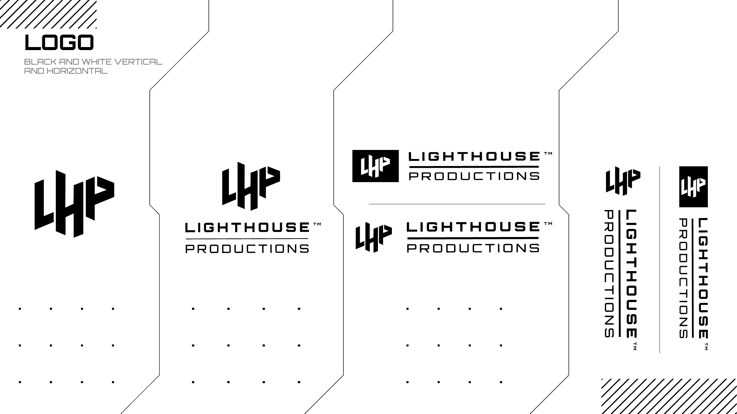
1. Logo Refinement
The updated logo draws inspiration from the geometry and discipline of a katana blade, a metaphor the client referenced in the original brief.
Instead of leaning into literal symbolism, the redesign focuses on:
Clean, precise line work
Strong geometric balance
A sharper silhouette
Improved legibility at all sizes
The result is a mark that feels more intentional, structured, and modern.
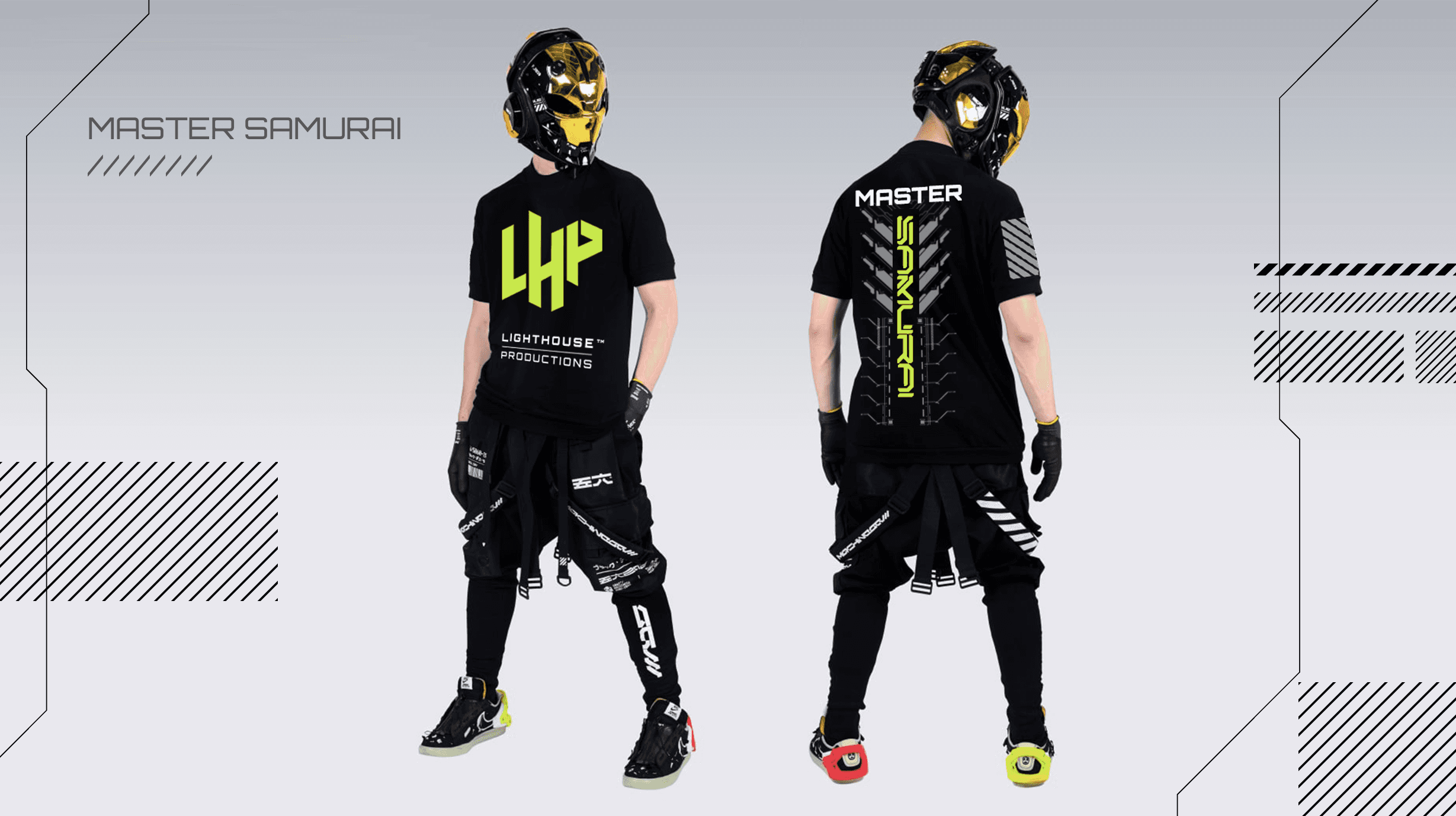
2. Visual Language
The identity system was expanded with supporting elements:
Core shapes and structural cues inspired by the “blade section” metaphor
High‑contrast compositions to emphasize clarity
Minimalist layouts that highlight the brand’s disciplined approach
A refined typographic system for consistency across touch points
These elements create a cohesive visual framework that supports both digital and print applications.
3. Brand Guidelines
A full guideline system was developed to ensure consistency:
Logo usage rules
Clear‑space and scaling
Color palette
Typography
Layout principles
Application examples
This gives the LHP team a reliable foundation for future brand growth.
---
Outcome
The refined LHP identity:
Preserves the essence of the original logo
Introduces a sharper, more contemporary visual presence
Strengthens recognition across all mediums
Reflects the precision and craftsmanship of the agency
Provides a scalable system for future brand expansion
The result is a brand identity that feels disciplined, modern, and aligned with LHP’s creative values, a clearer expression of the brand’s core.


Smooth Scroll
This will hide itself!
This will hide itself!
LHP (Brand Design)
OVERVIEW
LHP (Lighthouse Productions) approached us to refresh their existing logo and visual identity. The goal was to modernize the brand while preserving its legacy, creating a mark that reflects precision, discipline, and the creative strength of the team behind the company.
YEAR
2023
ROLE
Creative Designer
Brand Designer
SERVICES
Brand Identity
Brand Guidelines
Logo Refinement
CATEGORY
About the project
Project Objective
The client wanted to “breathe new life into the LHP logo,” refining the existing mark rather than replacing it. The challenge was to evolve the identity in a way that:
Honors the brand’s heritage
Introduces a sharper, more contemporary visual language
Strengthens recognition across digital and physical applications
Reflects the discipline and craftsmanship of the LHP team
The redesign needed to feel familiar, but elevated, a clearer expression of who LHP is today.
---
Research & Insights
Understanding the Brand
LHP is a multidisciplinary creative agency. Their work is defined by:
Precision
Technical skill
Creative discipline
A strong sense of craft
The existing logo had potential, but lacked clarity, structure, and a distinctive visual story.
Design Opportunity
The team referenced the original text:
“The client seeks to breathe new life into the LHP logo, revealing a legacy into the mark.”
This became the foundation for the redesign:
Reveal what was already there, sharpen, refine, and bring clarity to the identity.
---
Design Approach
1. Logo Refinement
The updated logo draws inspiration from the geometry and discipline of a katana blade, a metaphor the client referenced in the original brief.
Instead of leaning into literal symbolism, the redesign focuses on:
Clean, precise line work
Strong geometric balance
A sharper silhouette
Improved legibility at all sizes
The result is a mark that feels more intentional, structured, and modern.
2. Visual Language
The identity system was expanded with supporting elements:
Core shapes and structural cues inspired by the “blade section” metaphor
High‑contrast compositions to emphasize clarity
Minimalist layouts that highlight the brand’s disciplined approach
A refined typographic system for consistency across touch points
These elements create a cohesive visual framework that supports both digital and print applications.
3. Brand Guidelines
A full guideline system was developed to ensure consistency:
Logo usage rules
Clear‑space and scaling
Color palette
Typography
Layout principles
Application examples
This gives the LHP team a reliable foundation for future brand growth.
---
Outcome
The refined LHP identity:
Preserves the essence of the original logo
Introduces a sharper, more contemporary visual presence
Strengthens recognition across all mediums
Reflects the precision and craftsmanship of the agency
Provides a scalable system for future brand expansion
The result is a brand identity that feels disciplined, modern, and aligned with LHP’s creative values, a clearer expression of the brand’s core.
Smooth Scroll
This will hide itself!
This will hide itself!