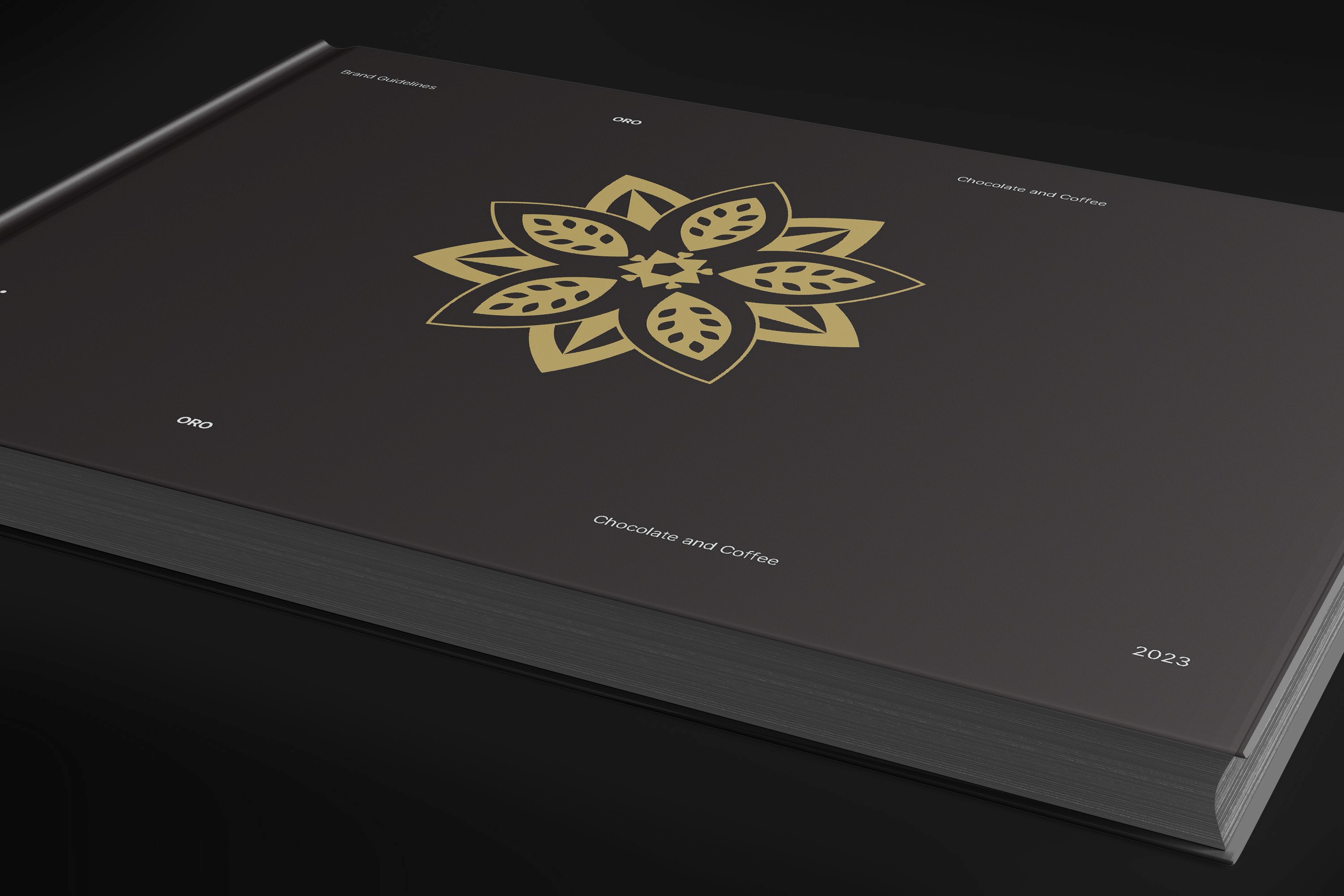
ORO is a Nicaragua‑origin chocolate and coffee brand entering the U.S. market with a focus on ethical sourcing and regenerative agriculture. The goal of this project was to build a brand identity and packaging system that communicates origin, transparency, and craft, while appealing to a conscious, modern consumer.
YEAR
2024
ROLE
Brand Designer
Illustrator
Visualizer
SERVICES
Brand Design
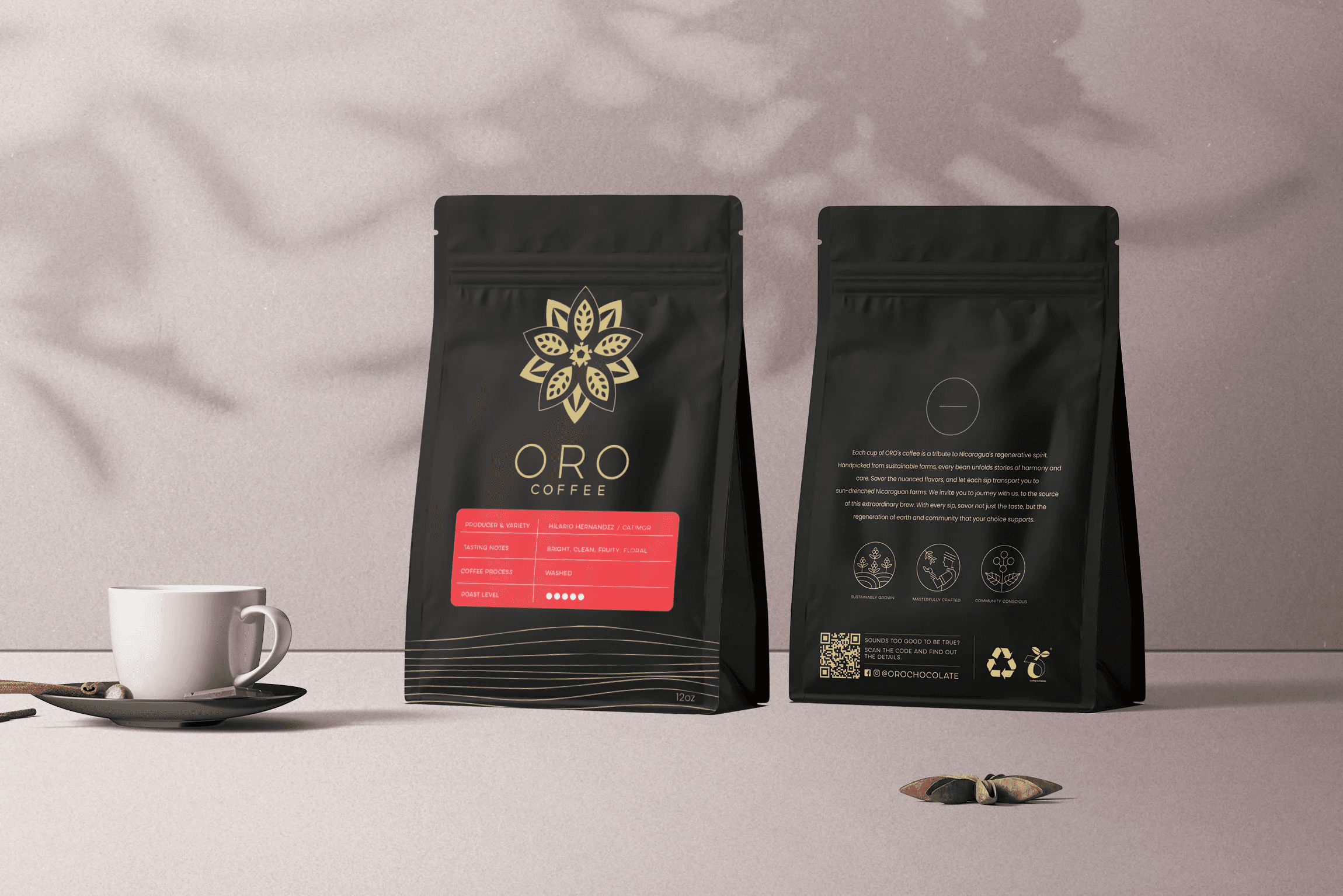
Packaging
Visualizations
CATEGORY
About the project
About the Project
Project Objective
ECHO DIGITAL partnered with me to develop the brand presence and packaging for ORO’s launch. The challenge was to translate the richness of Nicaragua’s landscape and the brand’s regenerative mission into a visual identity that feels premium, credible, and culturally grounded.
Design Goals
Build a brand system that reflects Nicaragua’s natural environment and agricultural heritage.
Communicate transparency and ethical sourcing without overwhelming the consumer.
Create packaging that stands out on shelves while remaining scalable across SKUs.
Balance craft aesthetics with modern, minimal design sensibilities.
---
Research & Insights
Understanding the Origin
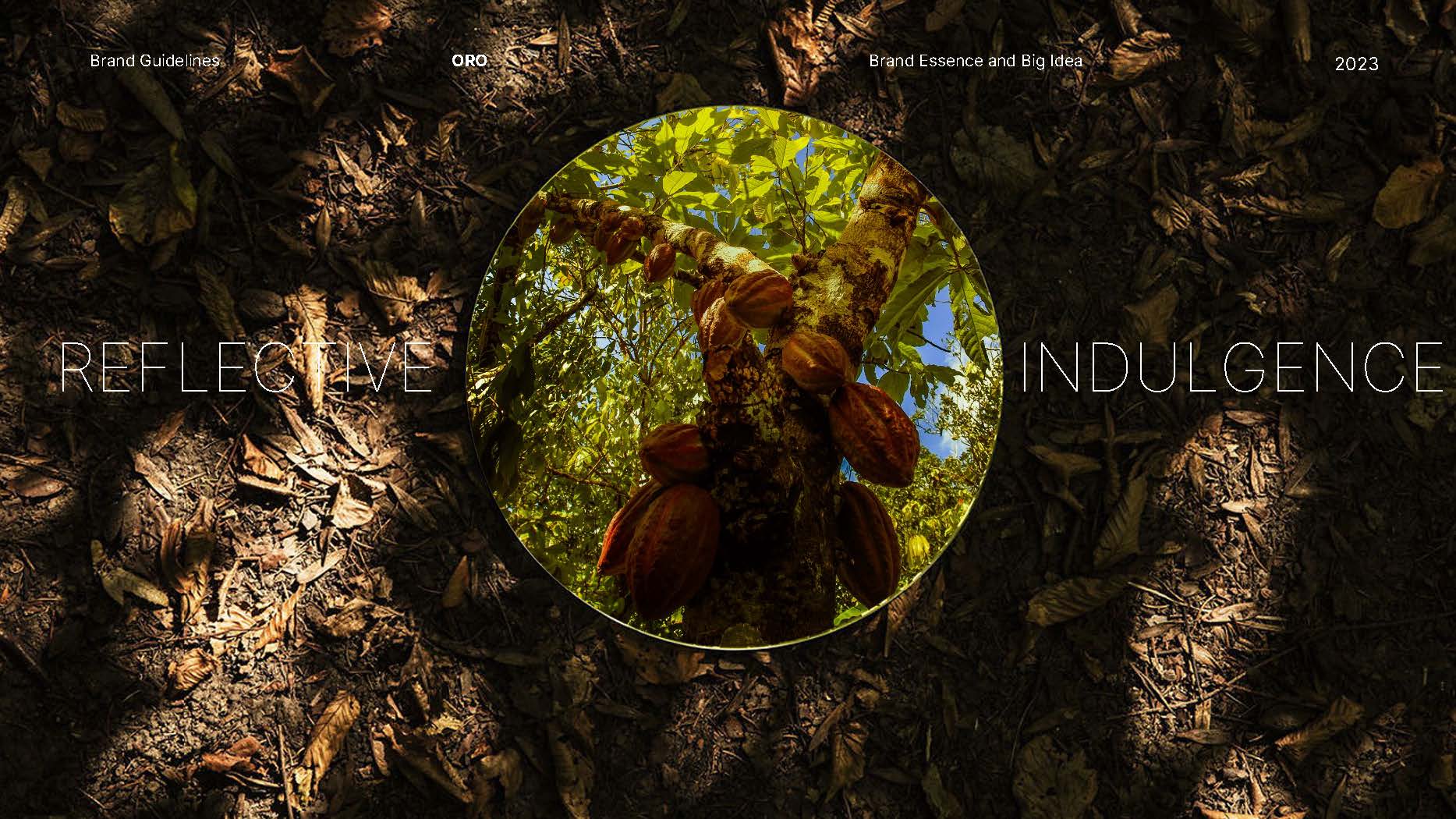
Nicaragua’s volcanic soil, tropical climate, and small‑scale farming communities shape the flavor and story behind ORO. These insights informed the visual direction:
Earth‑driven color palettes
Textures inspired by soil, foliage, and hand‑harvested crops
Illustrations referencing local flora and agricultural patterns
Target Audience
Conscious American consumers who value:
Ethical sourcing
Transparency
High‑quality craft products
Minimal, modern packaging
This audience responds well to brands that communicate authenticity through design rather than heavy storytelling.
---
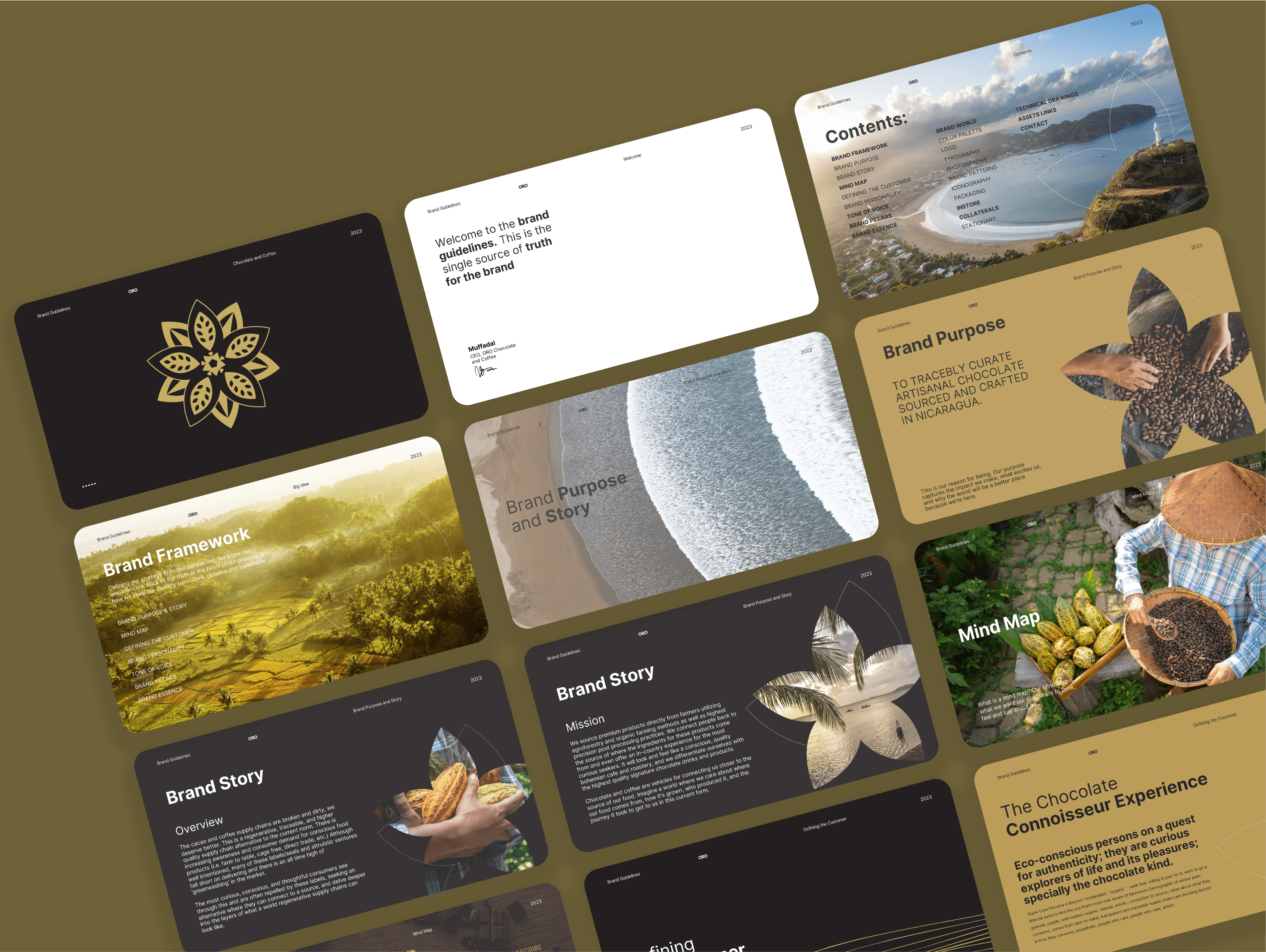
Brand Identity Development
Visual Language
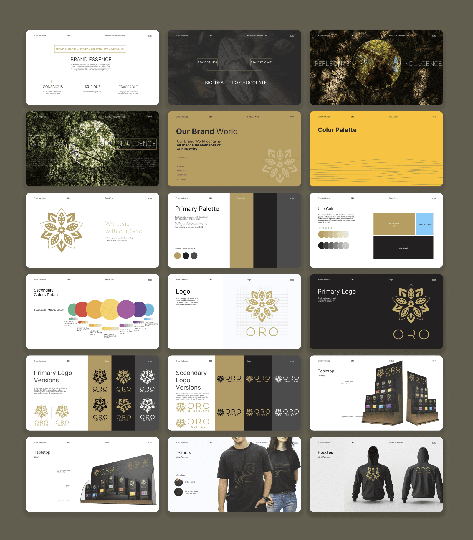
The identity blends natural textures with clean geometric structure, creating a balance between origin storytelling and modern retail appeal.
Key elements:
A refined logotype with subtle organic curves
A warm, earthy color system inspired by Nicaragua’s landscape
Hand‑drawn illustrations to highlight origin and craft
Minimal layouts to maintain clarity and premium positioning
Typography
A combination of:
A modern serif for heritage and warmth
A clean sans‑serif for clarity and readability
This pairing supports both storytelling and functional packaging hierarchy.
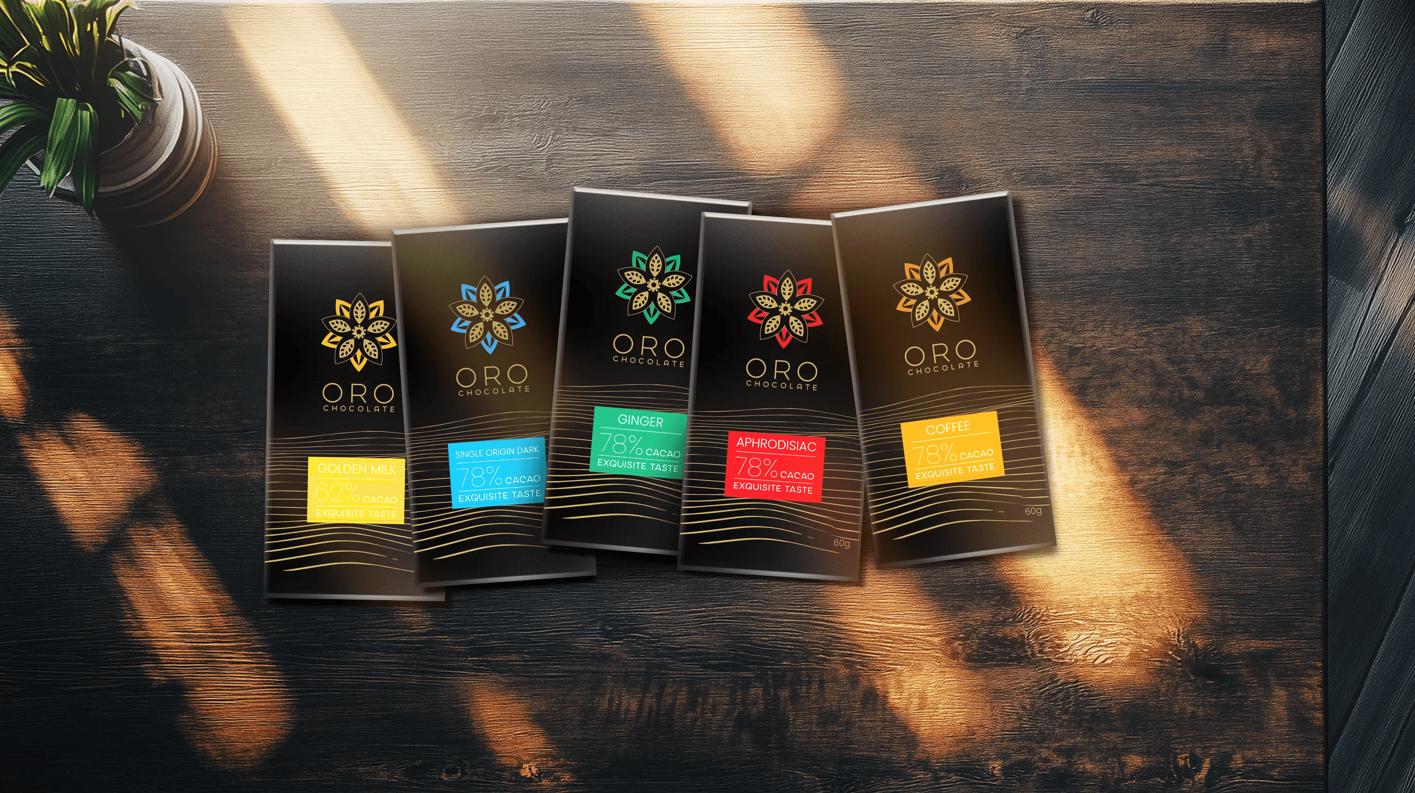
Packaging System
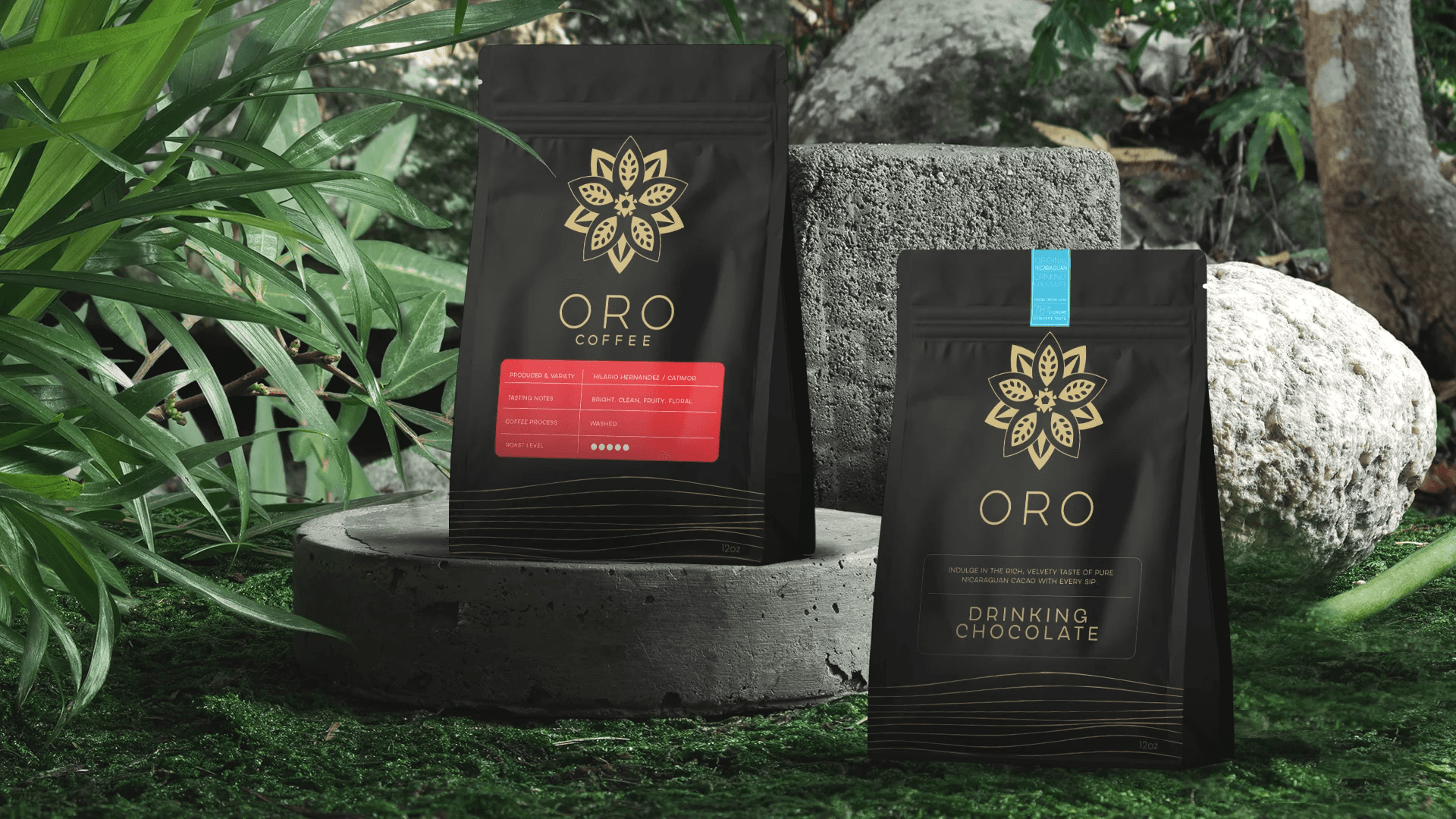
Structure & Hierarchy
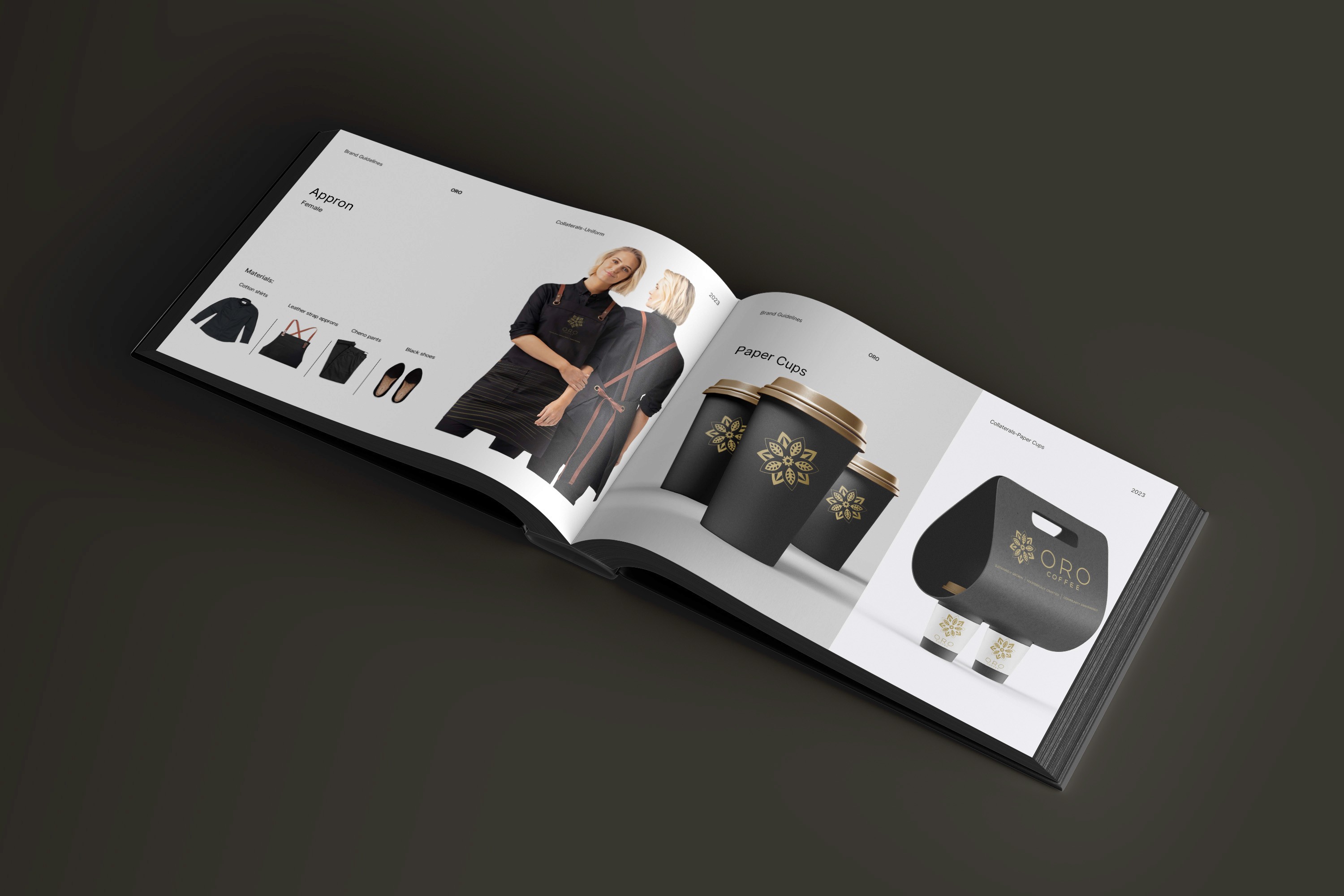
The packaging was designed to:
Clearly differentiate chocolate and coffee SKUs
Highlight origin and flavor notes
Maintain consistency across product lines
Scale easily for future expansions
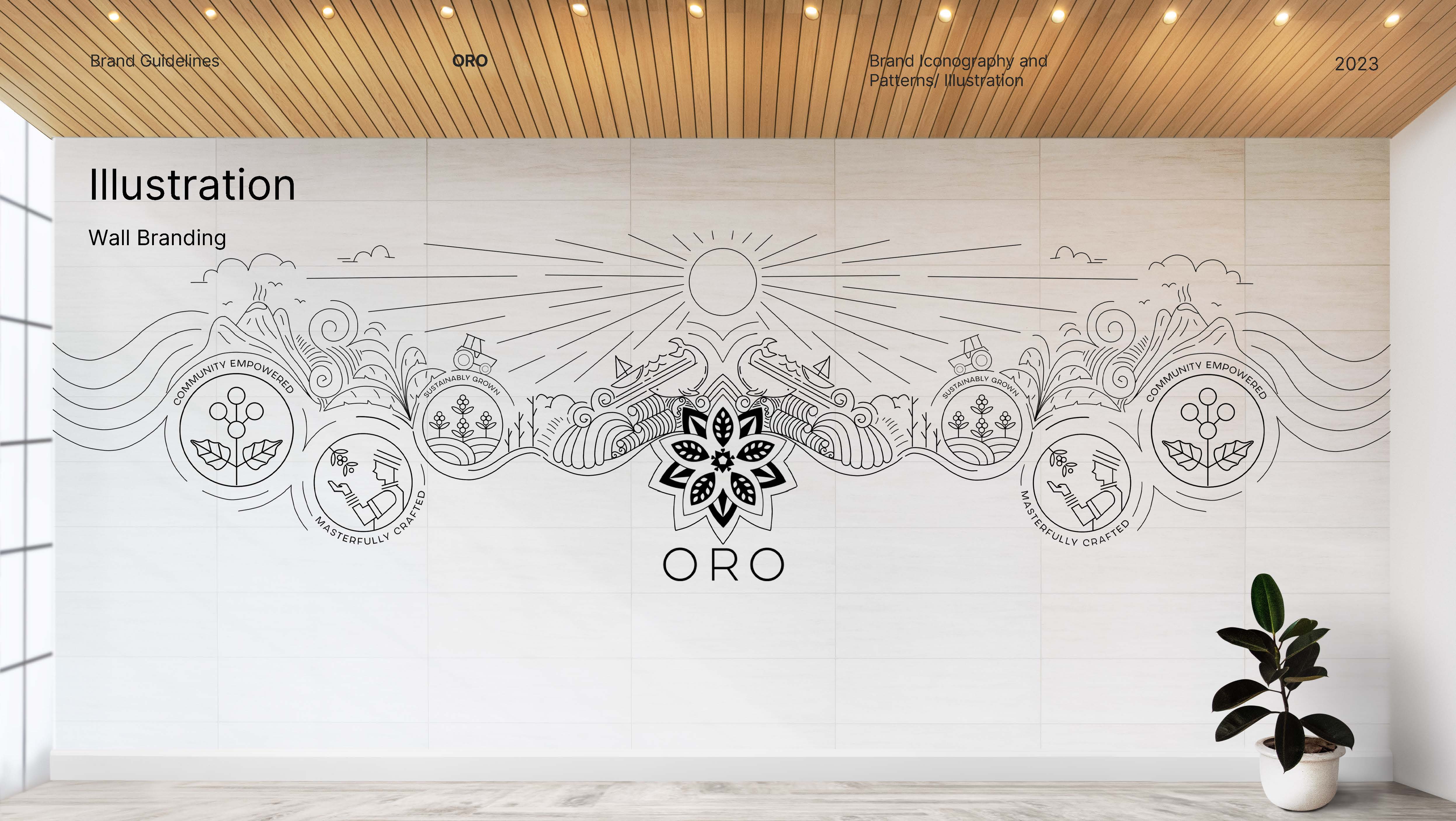
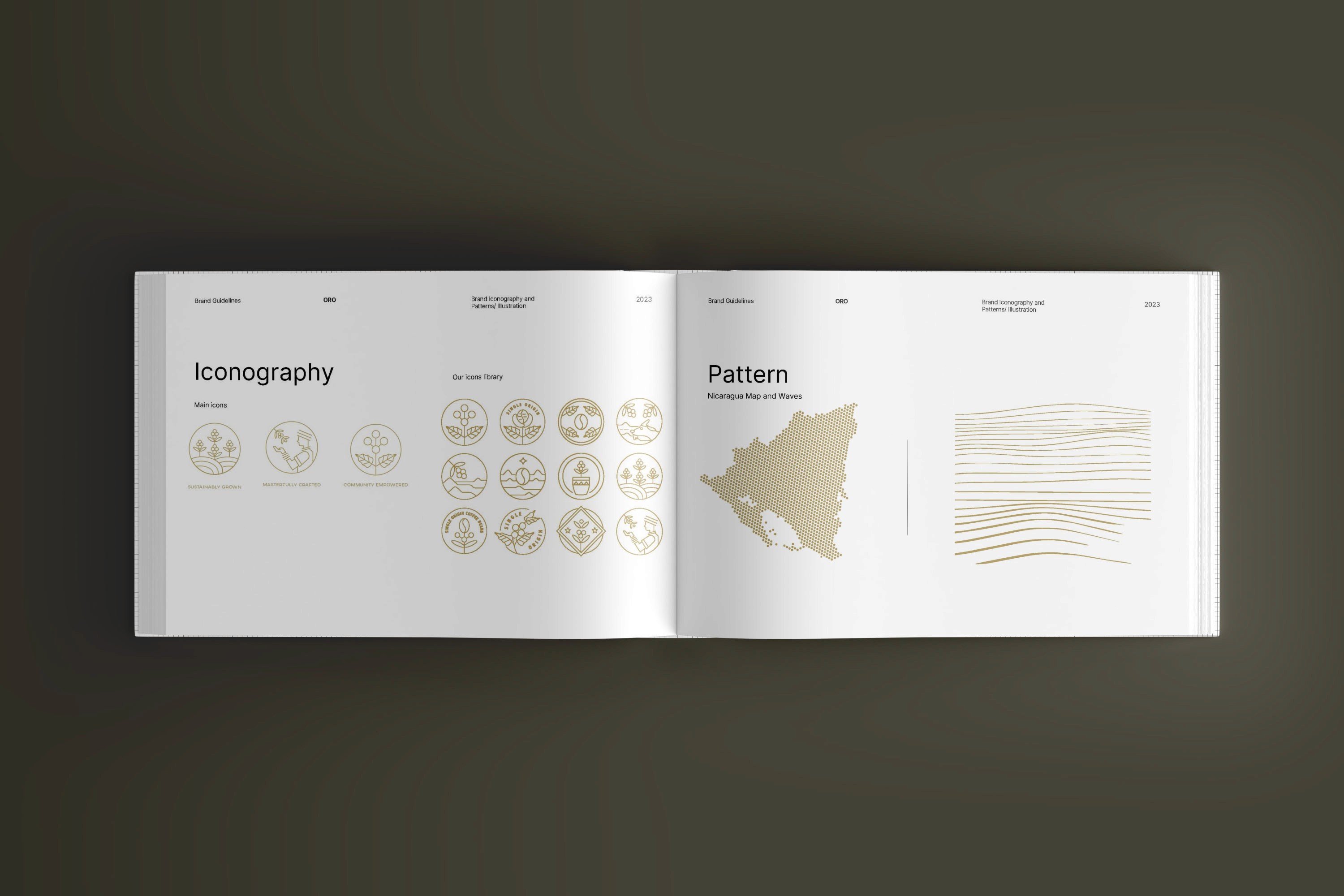
Illustration & Texture
Custom illustrations were created to represent:
Nicaragua’s rainforest
Volcanic landscapes
Agricultural patterns
These visuals help consumers understand the brand’s roots at a glance.
Sustainability Considerations
The packaging direction supports:
Minimal ink usage
Recyclable materials
Modular layouts to reduce production waste
---
Outcome
The final brand system positions ORO as a modern, ethical, origin‑driven chocolate and coffee brand. The identity:
Communicates authenticity without relying on heavy narrative
Differentiates ORO in a competitive craft market
Provides a scalable foundation for future product lines
Aligns with the brand’s mission of transparency and regeneration
This project demonstrates how brand identity and packaging can translate agricultural heritage into a contemporary, premium consumer experience.
Smooth Scroll
This will hide itself!
This will hide itself!
ORO Chocolate & Coffee (Brand Design)
OVERVIEW
ORO is a Nicaragua‑origin chocolate and coffee brand entering the U.S. market with a focus on ethical sourcing and regenerative agriculture. The goal of this project was to build a brand identity and packaging system that communicates origin, transparency, and craft, while appealing to a conscious, modern consumer.
YEAR
2024
ROLE
Brand Designer
Illustrator
Visualizer
SERVICES
Brand Design
Packaging
Visualizations
CATEGORY
About the project
About the Project
Project Objective
ECHO DIGITAL partnered with me to develop the brand presence and packaging for ORO’s launch. The challenge was to translate the richness of Nicaragua’s landscape and the brand’s regenerative mission into a visual identity that feels premium, credible, and culturally grounded.
Design Goals
Build a brand system that reflects Nicaragua’s natural environment and agricultural heritage.
Communicate transparency and ethical sourcing without overwhelming the consumer.
Create packaging that stands out on shelves while remaining scalable across SKUs.
Balance craft aesthetics with modern, minimal design sensibilities.
---
Research & Insights
Understanding the Origin
Nicaragua’s volcanic soil, tropical climate, and small‑scale farming communities shape the flavor and story behind ORO. These insights informed the visual direction:
Earth‑driven color palettes
Textures inspired by soil, foliage, and hand‑harvested crops
Illustrations referencing local flora and agricultural patterns
Target Audience
Conscious American consumers who value:
Ethical sourcing
Transparency
High‑quality craft products
Minimal, modern packaging
This audience responds well to brands that communicate authenticity through design rather than heavy storytelling.
---
Brand Identity Development
Visual Language
The identity blends natural textures with clean geometric structure, creating a balance between origin storytelling and modern retail appeal.
Key elements:
A refined logotype with subtle organic curves
A warm, earthy color system inspired by Nicaragua’s landscape
Hand‑drawn illustrations to highlight origin and craft
Minimal layouts to maintain clarity and premium positioning
Typography
A combination of:
A modern serif for heritage and warmth
A clean sans‑serif for clarity and readability
This pairing supports both storytelling and functional packaging hierarchy.
Packaging System
Structure & Hierarchy
The packaging was designed to:
Clearly differentiate chocolate and coffee SKUs
Highlight origin and flavor notes
Maintain consistency across product lines
Scale easily for future expansions
Illustration & Texture
Custom illustrations were created to represent:
Nicaragua’s rainforest
Volcanic landscapes
Agricultural patterns
These visuals help consumers understand the brand’s roots at a glance.
Sustainability Considerations
The packaging direction supports:
Minimal ink usage
Recyclable materials
Modular layouts to reduce production waste
---
Outcome
The final brand system positions ORO as a modern, ethical, origin‑driven chocolate and coffee brand. The identity:
Communicates authenticity without relying on heavy narrative
Differentiates ORO in a competitive craft market
Provides a scalable foundation for future product lines
Aligns with the brand’s mission of transparency and regeneration
This project demonstrates how brand identity and packaging can translate agricultural heritage into a contemporary, premium consumer experience.
Smooth Scroll
This will hide itself!
This will hide itself!
ORO Chocolate & Coffee (Brand Design)
OVERVIEW
ORO is a Nicaragua‑origin chocolate and coffee brand entering the U.S. market with a focus on ethical sourcing and regenerative agriculture. The goal of this project was to build a brand identity and packaging system that communicates origin, transparency, and craft, while appealing to a conscious, modern consumer.
YEAR
2024
ROLE
Brand Designer
Illustrator
Visualizer
SERVICES
Brand Design
Packaging
Visualizations
CATEGORY
About the project
About the Project
Project Objective
ECHO DIGITAL partnered with me to develop the brand presence and packaging for ORO’s launch. The challenge was to translate the richness of Nicaragua’s landscape and the brand’s regenerative mission into a visual identity that feels premium, credible, and culturally grounded.
Design Goals
Build a brand system that reflects Nicaragua’s natural environment and agricultural heritage.
Communicate transparency and ethical sourcing without overwhelming the consumer.
Create packaging that stands out on shelves while remaining scalable across SKUs.
Balance craft aesthetics with modern, minimal design sensibilities.
---
Research & Insights
Understanding the Origin
Nicaragua’s volcanic soil, tropical climate, and small‑scale farming communities shape the flavor and story behind ORO. These insights informed the visual direction:
Earth‑driven color palettes
Textures inspired by soil, foliage, and hand‑harvested crops
Illustrations referencing local flora and agricultural patterns
Target Audience
Conscious American consumers who value:
Ethical sourcing
Transparency
High‑quality craft products
Minimal, modern packaging
This audience responds well to brands that communicate authenticity through design rather than heavy storytelling.
---
Brand Identity Development
Visual Language
The identity blends natural textures with clean geometric structure, creating a balance between origin storytelling and modern retail appeal.
Key elements:
A refined logotype with subtle organic curves
A warm, earthy color system inspired by Nicaragua’s landscape
Hand‑drawn illustrations to highlight origin and craft
Minimal layouts to maintain clarity and premium positioning
Typography
A combination of:
A modern serif for heritage and warmth
A clean sans‑serif for clarity and readability
This pairing supports both storytelling and functional packaging hierarchy.
Packaging System
Structure & Hierarchy
The packaging was designed to:
Clearly differentiate chocolate and coffee SKUs
Highlight origin and flavor notes
Maintain consistency across product lines
Scale easily for future expansions
Illustration & Texture
Custom illustrations were created to represent:
Nicaragua’s rainforest
Volcanic landscapes
Agricultural patterns
These visuals help consumers understand the brand’s roots at a glance.
Sustainability Considerations
The packaging direction supports:
Minimal ink usage
Recyclable materials
Modular layouts to reduce production waste
---
Outcome
The final brand system positions ORO as a modern, ethical, origin‑driven chocolate and coffee brand. The identity:
Communicates authenticity without relying on heavy narrative
Differentiates ORO in a competitive craft market
Provides a scalable foundation for future product lines
Aligns with the brand’s mission of transparency and regeneration
This project demonstrates how brand identity and packaging can translate agricultural heritage into a contemporary, premium consumer experience.
Smooth Scroll
This will hide itself!
This will hide itself!