NRJ is a premium energy drink concept built around the idea of “pure potential.” The goal of this project was to create a brand identity and packaging system that communicates power, clarity, and modern performance, without relying on the visual noise commonly found in the energy drink category.

YEAR
2022
ROLE
Lead Brand Designer
Visualiser
SERVICES
Logo Design
Brand Identity
Product Packaging
CATEGORY
About the project
Project Objective
The energy drink category is dominated by aggressive graphics, heavy textures, and loud visual cues. NRJ needed a brand identity that would stand apart, something premium, minimal, and rooted in a clear conceptual foundation.
The objective was to design:
A distinctive logo system inspired by the universal symbol of stored energy
A packaging architecture that communicates power through simplicity
A visual identity that feels modern, clean, and high‑end
A scalable system for multiple flavors and future SKUs
The challenge was to express intensity without chaos, a refined, controlled form of energy.
---
Research & Insights
Category Analysis
Most energy drink brands rely on:
Metallic gradients
Explosive graphics
High‑contrast textures
Hyper‑masculine cues
NRJ needed to break from this pattern and appeal to a more design‑conscious, premium consumer.
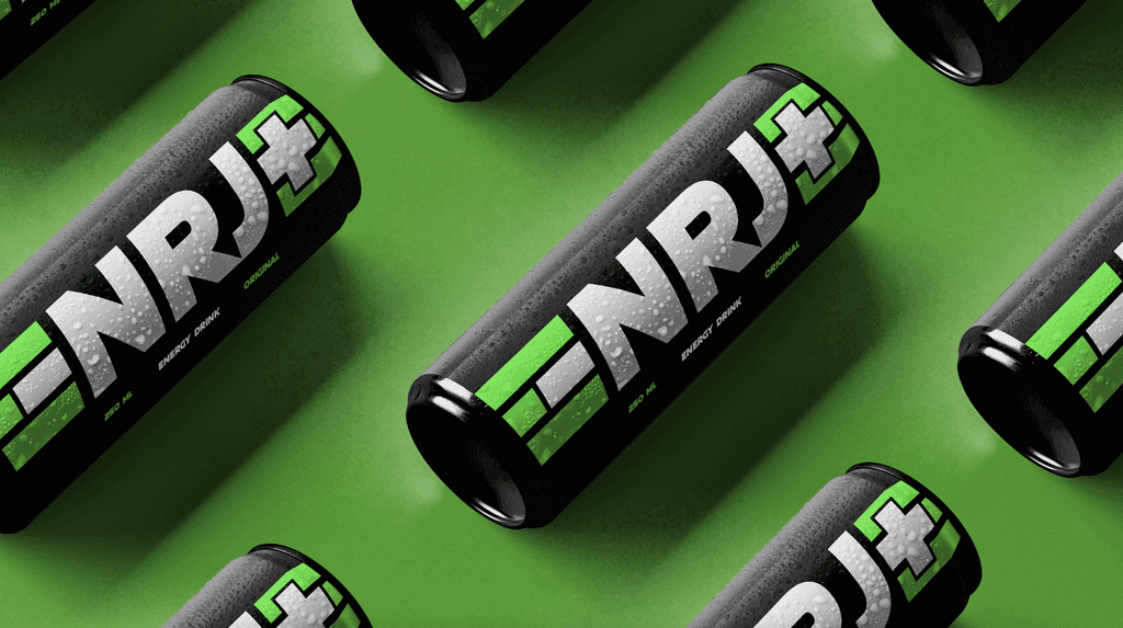
Concept Foundation: The Battery
The original brief referenced the battery as a symbol of stored power.
This became the core of the identity system.
From the PDF:
“We drew inspiration from the universal symbol of stored power, the battery. Its iconic polarity became our sacred geometry.”
This polarity, positive and negative, informed the logo, layout, and packaging structure.
---
Design Approach
1. Logo System
The NRJ logo was designed around:
Polarity symbols (+ / –)
Minimal geometric forms
A clean, modern typographic structure
The result is a mark that feels charged, directional, and instantly recognizable.
2. Packaging Architecture
The can design follows a strict, minimal hierarchy:
Bold vertical logotype
Polarity‑inspired accent marks
High‑contrast flavor identifiers
Clean information layout
This creates a premium, uncluttered presence on shelf, a stark contrast to typical energy drink packaging.
3. Visual Language
The identity uses:
Monochrome foundations to signal purity and focus
Accent colors to differentiate flavors
Minimalist compositions to reinforce the “stored energy” concept
Precise spacing and alignment to create a sense of controlled power
Every element supports the idea of refined force.
4. Flavor & SKU System
Each variant uses:
A dedicated accent color
A consistent layout structure
Clear naming hierarchy
Scalable design rules for future SKUs
This ensures strong shelf blocking and easy recognition.
---
Outcome
The final NRJ identity and packaging system delivers:
A premium, minimalist alternative within the energy drink category
A strong conceptual foundation rooted in battery polarity
A scalable visual system for multiple flavors and formats
Packaging that communicates power through clarity, not chaos
A modern, design‑driven aesthetic that appeals to a high‑end consumer base
NRJ stands as a brand built on focused energy, intentional design, and controlled intensity, a refreshing departure from traditional category norms.


Smooth Scroll
This will hide itself!
This will hide itself!
NRJ Energy Drink (Brand Design)
OVERVIEW
NRJ is a premium energy drink concept built around the idea of “pure potential.” The goal of this project was to create a brand identity and packaging system that communicates power, clarity, and modern performance, without relying on the visual noise commonly found in the energy drink category.
YEAR
2022
ROLE
Lead Brand Designer
Visualiser
SERVICES
Logo Design
Brand Identity
Product Packaging
CATEGORY
About the project
Project Objective
The energy drink category is dominated by aggressive graphics, heavy textures, and loud visual cues. NRJ needed a brand identity that would stand apart, something premium, minimal, and rooted in a clear conceptual foundation.
The objective was to design:
A distinctive logo system inspired by the universal symbol of stored energy
A packaging architecture that communicates power through simplicity
A visual identity that feels modern, clean, and high‑end
A scalable system for multiple flavors and future SKUs
The challenge was to express intensity without chaos, a refined, controlled form of energy.
---
Research & Insights
Category Analysis
Most energy drink brands rely on:
Metallic gradients
Explosive graphics
High‑contrast textures
Hyper‑masculine cues
NRJ needed to break from this pattern and appeal to a more design‑conscious, premium consumer.
Concept Foundation: The Battery
The original brief referenced the battery as a symbol of stored power.
This became the core of the identity system.
From the PDF:
“We drew inspiration from the universal symbol of stored power, the battery. Its iconic polarity became our sacred geometry.”
This polarity, positive and negative, informed the logo, layout, and packaging structure.
---
Design Approach
1. Logo System
The NRJ logo was designed around:
Polarity symbols (+ / –)
Minimal geometric forms
A clean, modern typographic structure
The result is a mark that feels charged, directional, and instantly recognizable.
2. Packaging Architecture
The can design follows a strict, minimal hierarchy:
Bold vertical logotype
Polarity‑inspired accent marks
High‑contrast flavor identifiers
Clean information layout
This creates a premium, uncluttered presence on shelf, a stark contrast to typical energy drink packaging.
3. Visual Language
The identity uses:
Monochrome foundations to signal purity and focus
Accent colors to differentiate flavors
Minimalist compositions to reinforce the “stored energy” concept
Precise spacing and alignment to create a sense of controlled power
Every element supports the idea of refined force.
4. Flavor & SKU System
Each variant uses:
A dedicated accent color
A consistent layout structure
Clear naming hierarchy
Scalable design rules for future SKUs
This ensures strong shelf blocking and easy recognition.
---
Outcome
The final NRJ identity and packaging system delivers:
A premium, minimalist alternative within the energy drink category
A strong conceptual foundation rooted in battery polarity
A scalable visual system for multiple flavors and formats
Packaging that communicates power through clarity, not chaos
A modern, design‑driven aesthetic that appeals to a high‑end consumer base
NRJ stands as a brand built on focused energy, intentional design, and controlled intensity, a refreshing departure from traditional category norms.
Smooth Scroll
This will hide itself!
This will hide itself!