Brawl3rs is a first-of-its-kind AI autobattler built on Unreal Engine 5 where meme-coin-inspired characters fight each other, with outcomes determined by real data and AI. Players can watch live fights, trade on character outcomes through a derivatives market, climb ranked leaderboards, and engage in high-stakes “degen mode” betting, all wrapped in the irreverent energy of meme-coin culture. Real World Gaming hired me to establish the entire design direction for the product from the ground up. There was no existing brand, no UI system, and no visual identity, just a game concept and a team of 16 ready to build. My job was to create the logo, define the UI look and feel, design every major screen and interaction, and produce the social media assets that would launch the brand on Twitter and Discord.
About the project
THE ORIGIN STORY: FROGS VS DOGS
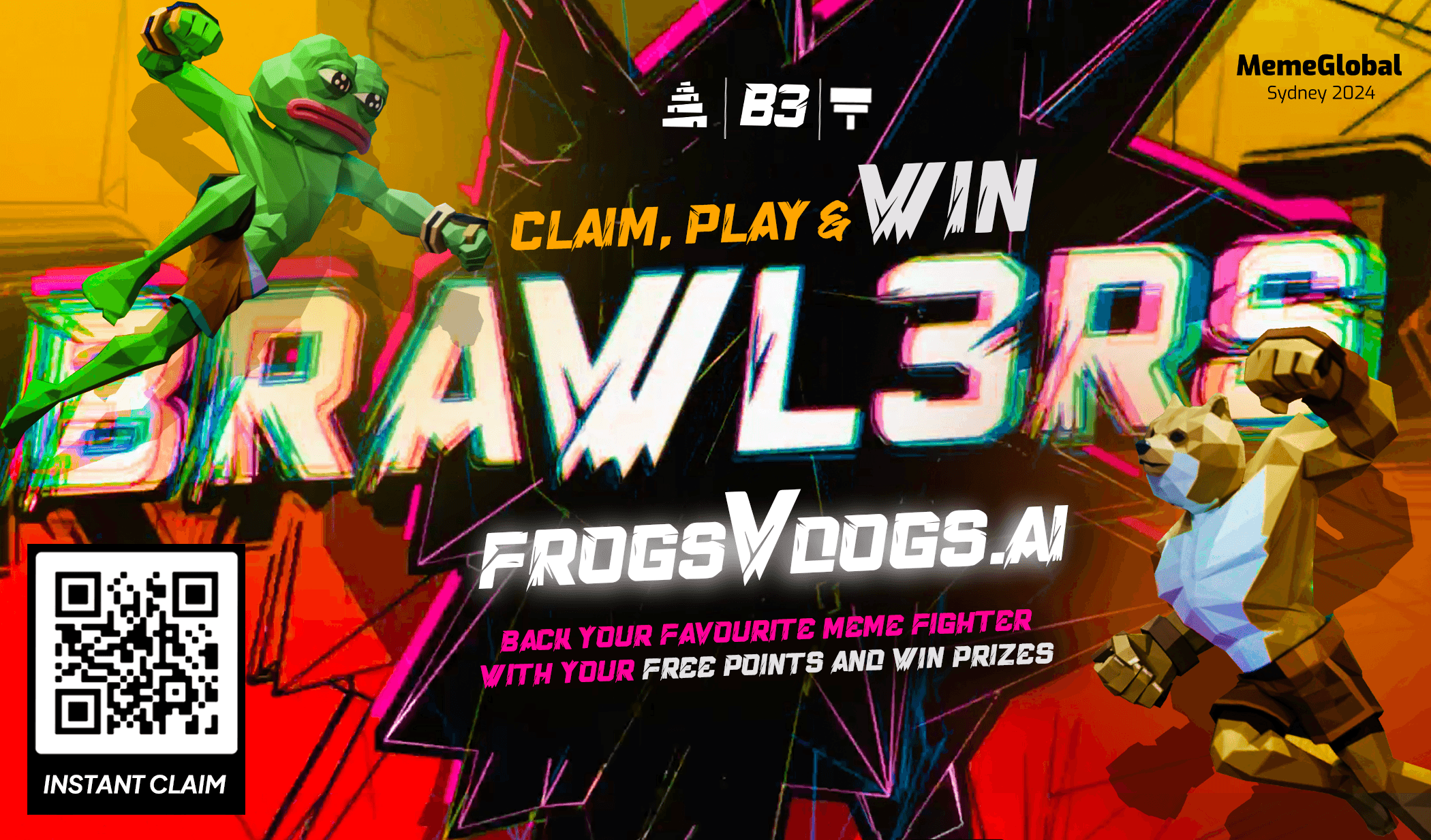
The project didn’t start as Brawl3rs. It began under the working title “Frogs vs Dogs”, a concept inspired by two of crypto’s most iconic meme coins: Pepe (the frog) and Doge (the dog). The original idea was a head-to-head battler themed around these two communities.
As the product vision evolved, the team realized the game had far more potential than a two-character rivalry. The roster expanded, the mechanics deepened, and the brand needed to grow with it. “Frogs vs Dogs” became Brawl3rs, a name that captured the combative, chaotic energy of the game while leaving room for an unlimited roster of meme-inspired fighters. This evolution directly shaped my design work: the brand system I built had to feel rooted in meme culture while being flexible enough to scale well beyond its origins.
THE CHALLENGE
Designing for Brawl3rs meant solving several problems simultaneously:
No existing brand: There was no logo, no color palette, no typography system, and no visual language. Everything needed to be created from scratch and feel immediately recognizable in the crowded Web3 gaming space.
Bridging two worlds: The UI needed to serve two very different user mindsets, gamers who want immersive, high-energy visuals and crypto traders who need clean, scannable data. Leaderboards, fight rosters, and derivatives markets all had to coexist in a single coherent interface.
Dark-theme gaming UI: The platform demanded a dark, atmospheric interface that could showcase character art and 3D visuals while keeping dense data like trading tables, price charts, and activity streams highly readable.
Speed: With a team of 16 already building, I had two months to go from zero to a complete, implementation-ready design system, logo, UI, components, responsive layouts, and social assets.
Responsive from day one: The platform needed to work seamlessly across desktop, tablet, and mobile breakpoints, each with its own navigation and layout considerations.
MY APPROACH
1. Brand Identity & Logo
I started with the brand. The logo needed to convey combat, energy, and the playful irreverence of meme culture, while still feeling polished enough for a real product. I explored directions that leaned into the Web3 aesthetic (the “3” in Brawl3rs replacing the “E” is a deliberate nod to crypto naming conventions) and settled on a bold, stylized word mark that could hold its own as a favicon, a Twitter profile picture, or a full-width header.
2. Color System & Visual Language
The color palette was built around a deep, dark background with neon green as the primary accent, a combination that feels native to both gaming culture and crypto trading interfaces. Secondary accents in orange, red, and yellow were introduced for status indicators, alerts, and character-specific highlights. I established a clear color hierarchy: green for primary actions and positive signals, red for warnings and negative trends, and subtle gradients for depth and atmosphere.
3. Core UI Screens
With the visual foundation set, I designed every major screen of the platform:
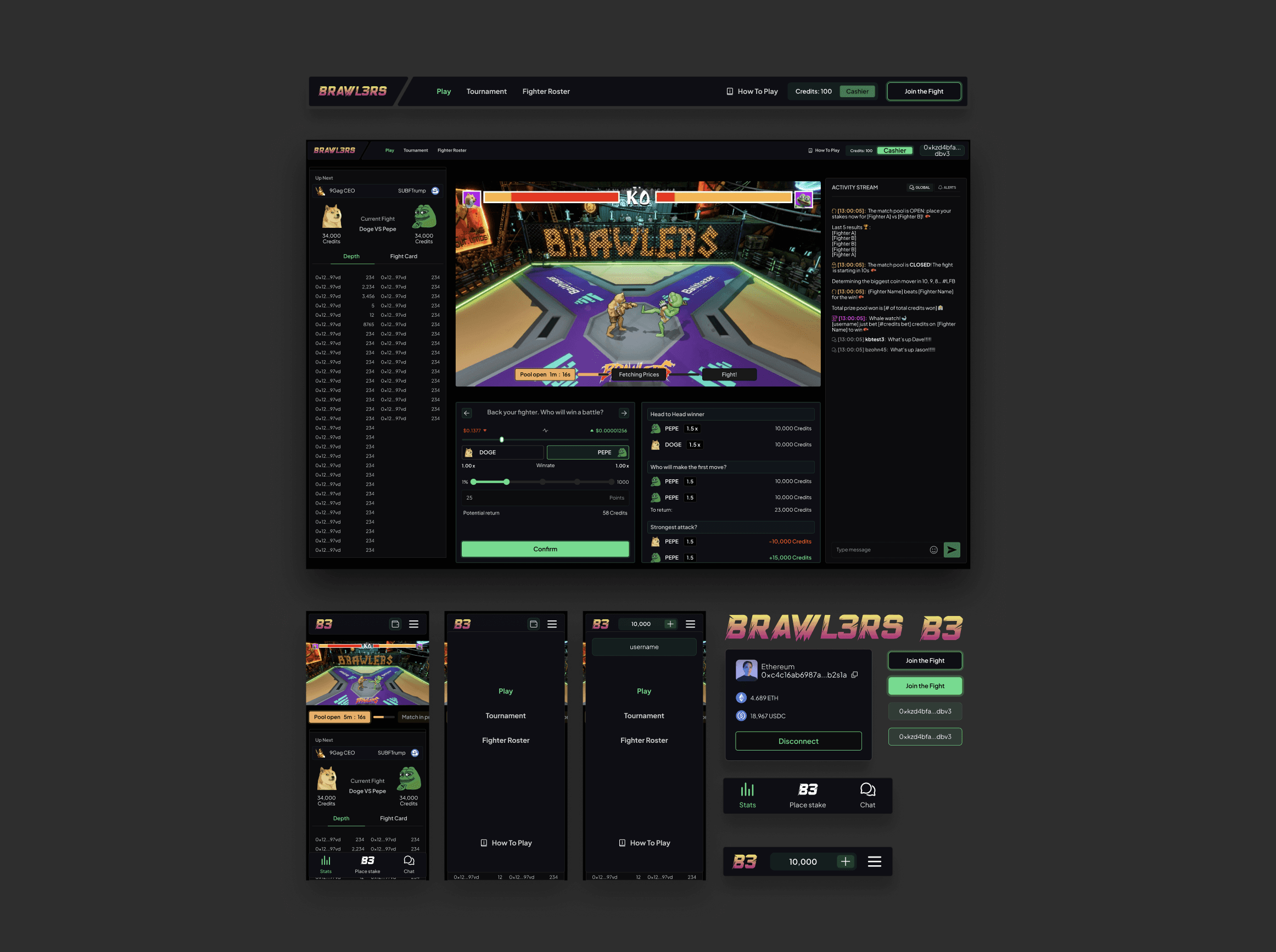
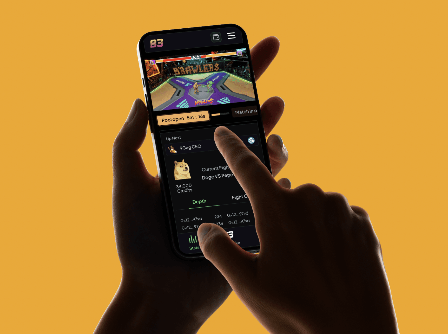
Fight Roster & Live Stream: The centerpiece of the experience. I designed the fight selection interface where players browse upcoming matches, view character stats, and place bets. The live stream view integrates the video feed with real-time activity streams and chat, keeping the social energy front and center.
Derivatives Market: A full trading interface for betting on character outcomes. This required a careful balance of gaming energy and financial UI clarity — price charts, order flows, and position tracking all styled within the Brawl3rs visual language.
Leaderboards & Rankings: Both player leaderboards and character leaderboards with comparison views, previous fight histories, and detailed stat breakdowns. I designed these to feel competitive and aspirational.
Profile & Quests:A player profile system with quest tracking, progression indicators, and achievement displays. This went through three design iterations (0.0, 1.0, 2.0) as the feature scope evolved.
Cashier & Credits: Buy credits, manage withdrawals, and handle deposits. I designed these flows to feel secure and trustworthy while maintaining the overall brand energy.
Turbo Mode: An accelerated gameplay mode with its own visual treatment — designed to feel faster and more intense through tighter layouts and heightened visual contrast.
Degen Mode : A high-risk betting overlay that transforms the interface with a more aggressive visual treatment, signaling to users that they’re in elevated-stakes territory.
Welcome & Onboarding: First-time user modals designed across web, tablet, and mobile to get players oriented quickly without killing the excitement.
4. Responsive Design System
Every screen was designed across three breakpoints: desktop, tablet, and mobile. This wasn’t just a matter of reflowing content, navigation patterns shifted entirely between form factors. Desktop uses a horizontal top navigation with persistent sidebars; mobile collapses into a streamlined bottom-tab navigation with drawer-based filters. The fight roster, derivatives market, and leaderboards each required dedicated layout thinking at every breakpoint.
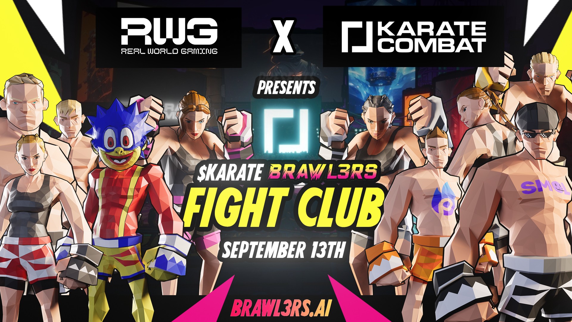
5. Social Media & Community Assets
Beyond the product UI, I created the digital assets that launched the Brawl3rs brand across Twitter and Discord. This included profile images, banner graphics, announcement templates, and promotional visuals, all designed to translate the in-product energy into scroll-stopping social content that could build community before the game even launched.
KEY DESIGN DECISIONS
Dark theme as brand identity: In most products, dark mode is an option. For Brawl3rs, the dark interface is the brand. Every color, every contrast ratio, every glow effect was designed specifically for dark backgrounds. This made the character art pop, gave the trading interfaces a professional edge, and aligned the product with the visual expectations of both gaming and crypto audiences.
Neon green as the signature accent: Green was chosen deliberately. It reads as “go” in gaming contexts and “profit” in trading contexts, a single color that speaks both languages. Combined with the dark backgrounds, it creates an immediately recognizable look that sets Brawl3rs apart from competitors using the more typical purple-and-blue Web3 palette.
Activity stream as social proof: I integrated a persistent activity stream and chat into key views, ensuring that players always see what others are doing. In a betting and competitive gaming context, social activity is content, seeing other players’ bets, wins, and reactions drives engagement.
Progressive complexity: Features like Degen Mode and Turbo aren’t visible by default. I designed the interface with layered complexity, new users see a clean, approachable experience, while experienced players can unlock more aggressive UI treatments as they go deeper.
Component-first at speed: Despite the two-month timeline, I built a component system rather than designing isolated screens. This meant the development team of 16 could start building with consistent patterns immediately, and new features could be assembled from existing pieces rather than requiring fresh design work for every screen.
WHAT I DELIVERED
In two months, working as the sole UI designer alongside a team of 16 developers, game designers, and 3D artists, I delivered:
Brand identity: Logo, word mark, color system, and typographic hierarchy.
Complete UI design system: Component library with buttons, cards, panels, navigation, modals, form controls, data tables, charts, and status indicators, all built for dark-theme use.
10+ major screen designs: Fight Roster, Live Stream, Derivatives Market, Player & Character Leaderboards, Rankings, Profile & Quests, Cashier, Turbo Mode, Degen Mode, Welcome/Onboarding, and Activity Stream with Chat.
Full responsive layouts: Desktop, tablet, and mobile breakpoints for every screen with dedicated navigation patterns per form factor.
Social media assets: Twitter and Discord graphics including profile images, banners, announcement templates, and promotional visuals.
UX iterations: Multiple rounds of refinement on key flows like trading with the shuriken mechanic, price change animations, and profile progression.
OUTCOME
Brawl3rs launched in 2023 and remains live at brawl3rs.ai. The design system I established gave the development team a clear, implementation-ready foundation that allowed them to build and iterate quickly. The brand identity translated successfully from product UI to social channels, helping build a community on Twitter and Discord before and through launch.
For a project that went from a blank canvas to a shipped product in two months, the key was the decision to invest time upfront in brand and component foundations rather than rushing into screen-by-screen design. That upfront discipline is what made the pace sustainable and the output consistent.
REFLECTION
Brawl3rs was one of the most creatively demanding projects I’ve worked on. Building a brand and a full UI system from nothing, under a two-month deadline, for a product that blends gaming, trading, and meme culture, required me to make strong design decisions quickly and stand behind them.
The project taught me a lot about designing at the intersection of entertainment and finance. A trading table needs to be just as scannable in Brawl3rs as it would be on a stock exchange, but it also needs to feel like it belongs in a game. That tension between clarity and energy ran through every design decision, and finding the right balance was the creative challenge that made this project so rewarding.
Watching the name evolve from Frogs vs Dogs to Brawl3rs also reinforced something I value: design systems should be built to flex. The visual identity I created wasn’t tied to two characters or a single concept, it was built to support whatever direction the product grew into. That flexibility is what allowed the brand to survive a fundamental naming and concept shift and come out stronger.


This will hide itself!
Brawl3rs is a first-of-its-kind AI autobattler built on Unreal Engine 5 where meme-coin-inspired characters fight each other, with outcomes determined by real data and AI. Players can watch live fights, trade on character outcomes through a derivatives market, climb ranked leaderboards, and engage in high-stakes “degen mode” betting, all wrapped in the irreverent energy of meme-coin culture. Real World Gaming hired me to establish the entire design direction for the product from the ground up. There was no existing brand, no UI system, and no visual identity, just a game concept and a team of 16 ready to build. My job was to create the logo, define the UI look and feel, design every major screen and interaction, and produce the social media assets that would launch the brand on Twitter and Discord.
About the project
THE ORIGIN STORY: FROGS VS DOGS
The project didn’t start as Brawl3rs. It began under the working title “Frogs vs Dogs”, a concept inspired by two of crypto’s most iconic meme coins: Pepe (the frog) and Doge (the dog). The original idea was a head-to-head battler themed around these two communities.
As the product vision evolved, the team realized the game had far more potential than a two-character rivalry. The roster expanded, the mechanics deepened, and the brand needed to grow with it. “Frogs vs Dogs” became Brawl3rs, a name that captured the combative, chaotic energy of the game while leaving room for an unlimited roster of meme-inspired fighters. This evolution directly shaped my design work: the brand system I built had to feel rooted in meme culture while being flexible enough to scale well beyond its origins.
THE CHALLENGE
Designing for Brawl3rs meant solving several problems simultaneously:
No existing brand: There was no logo, no color palette, no typography system, and no visual language. Everything needed to be created from scratch and feel immediately recognizable in the crowded Web3 gaming space.
Bridging two worlds: The UI needed to serve two very different user mindsets, gamers who want immersive, high-energy visuals and crypto traders who need clean, scannable data. Leaderboards, fight rosters, and derivatives markets all had to coexist in a single coherent interface.
Dark-theme gaming UI: The platform demanded a dark, atmospheric interface that could showcase character art and 3D visuals while keeping dense data like trading tables, price charts, and activity streams highly readable.
Speed: With a team of 16 already building, I had two months to go from zero to a complete, implementation-ready design system, logo, UI, components, responsive layouts, and social assets.
Responsive from day one: The platform needed to work seamlessly across desktop, tablet, and mobile breakpoints, each with its own navigation and layout considerations.
MY APPROACH
1. Brand Identity & Logo
I started with the brand. The logo needed to convey combat, energy, and the playful irreverence of meme culture, while still feeling polished enough for a real product. I explored directions that leaned into the Web3 aesthetic (the “3” in Brawl3rs replacing the “E” is a deliberate nod to crypto naming conventions) and settled on a bold, stylized word mark that could hold its own as a favicon, a Twitter profile picture, or a full-width header.
2. Color System & Visual Language
The color palette was built around a deep, dark background with neon green as the primary accent, a combination that feels native to both gaming culture and crypto trading interfaces. Secondary accents in orange, red, and yellow were introduced for status indicators, alerts, and character-specific highlights. I established a clear color hierarchy: green for primary actions and positive signals, red for warnings and negative trends, and subtle gradients for depth and atmosphere.
3. Core UI Screens
With the visual foundation set, I designed every major screen of the platform:
Fight Roster & Live Stream: The centerpiece of the experience. I designed the fight selection interface where players browse upcoming matches, view character stats, and place bets. The live stream view integrates the video feed with real-time activity streams and chat, keeping the social energy front and center.
Derivatives Market: A full trading interface for betting on character outcomes. This required a careful balance of gaming energy and financial UI clarity — price charts, order flows, and position tracking all styled within the Brawl3rs visual language.
Leaderboards & Rankings: Both player leaderboards and character leaderboards with comparison views, previous fight histories, and detailed stat breakdowns. I designed these to feel competitive and aspirational.
Profile & Quests:A player profile system with quest tracking, progression indicators, and achievement displays. This went through three design iterations (0.0, 1.0, 2.0) as the feature scope evolved.
Cashier & Credits: Buy credits, manage withdrawals, and handle deposits. I designed these flows to feel secure and trustworthy while maintaining the overall brand energy.
Turbo Mode: An accelerated gameplay mode with its own visual treatment — designed to feel faster and more intense through tighter layouts and heightened visual contrast.
Degen Mode : A high-risk betting overlay that transforms the interface with a more aggressive visual treatment, signaling to users that they’re in elevated-stakes territory.
Welcome & Onboarding: First-time user modals designed across web, tablet, and mobile to get players oriented quickly without killing the excitement.
4. Responsive Design System
Every screen was designed across three breakpoints: desktop, tablet, and mobile. This wasn’t just a matter of reflowing content, navigation patterns shifted entirely between form factors. Desktop uses a horizontal top navigation with persistent sidebars; mobile collapses into a streamlined bottom-tab navigation with drawer-based filters. The fight roster, derivatives market, and leaderboards each required dedicated layout thinking at every breakpoint.
5. Social Media & Community Assets
Beyond the product UI, I created the digital assets that launched the Brawl3rs brand across Twitter and Discord. This included profile images, banner graphics, announcement templates, and promotional visuals, all designed to translate the in-product energy into scroll-stopping social content that could build community before the game even launched.
KEY DESIGN DECISIONS
Dark theme as brand identity: In most products, dark mode is an option. For Brawl3rs, the dark interface is the brand. Every color, every contrast ratio, every glow effect was designed specifically for dark backgrounds. This made the character art pop, gave the trading interfaces a professional edge, and aligned the product with the visual expectations of both gaming and crypto audiences.
Neon green as the signature accent: Green was chosen deliberately. It reads as “go” in gaming contexts and “profit” in trading contexts, a single color that speaks both languages. Combined with the dark backgrounds, it creates an immediately recognizable look that sets Brawl3rs apart from competitors using the more typical purple-and-blue Web3 palette.
Activity stream as social proof: I integrated a persistent activity stream and chat into key views, ensuring that players always see what others are doing. In a betting and competitive gaming context, social activity is content, seeing other players’ bets, wins, and reactions drives engagement.
Progressive complexity: Features like Degen Mode and Turbo aren’t visible by default. I designed the interface with layered complexity, new users see a clean, approachable experience, while experienced players can unlock more aggressive UI treatments as they go deeper.
Component-first at speed: Despite the two-month timeline, I built a component system rather than designing isolated screens. This meant the development team of 16 could start building with consistent patterns immediately, and new features could be assembled from existing pieces rather than requiring fresh design work for every screen.
WHAT I DELIVERED
In two months, working as the sole UI designer alongside a team of 16 developers, game designers, and 3D artists, I delivered:
Brand identity: Logo, word mark, color system, and typographic hierarchy.
Complete UI design system: Component library with buttons, cards, panels, navigation, modals, form controls, data tables, charts, and status indicators, all built for dark-theme use.
10+ major screen designs: Fight Roster, Live Stream, Derivatives Market, Player & Character Leaderboards, Rankings, Profile & Quests, Cashier, Turbo Mode, Degen Mode, Welcome/Onboarding, and Activity Stream with Chat.
Full responsive layouts: Desktop, tablet, and mobile breakpoints for every screen with dedicated navigation patterns per form factor.
Social media assets: Twitter and Discord graphics including profile images, banners, announcement templates, and promotional visuals.
UX iterations: Multiple rounds of refinement on key flows like trading with the shuriken mechanic, price change animations, and profile progression.
OUTCOME
Brawl3rs launched in 2023 and remains live at brawl3rs.ai. The design system I established gave the development team a clear, implementation-ready foundation that allowed them to build and iterate quickly. The brand identity translated successfully from product UI to social channels, helping build a community on Twitter and Discord before and through launch.
For a project that went from a blank canvas to a shipped product in two months, the key was the decision to invest time upfront in brand and component foundations rather than rushing into screen-by-screen design. That upfront discipline is what made the pace sustainable and the output consistent.
REFLECTION
Brawl3rs was one of the most creatively demanding projects I’ve worked on. Building a brand and a full UI system from nothing, under a two-month deadline, for a product that blends gaming, trading, and meme culture, required me to make strong design decisions quickly and stand behind them.
The project taught me a lot about designing at the intersection of entertainment and finance. A trading table needs to be just as scannable in Brawl3rs as it would be on a stock exchange, but it also needs to feel like it belongs in a game. That tension between clarity and energy ran through every design decision, and finding the right balance was the creative challenge that made this project so rewarding.
Watching the name evolve from Frogs vs Dogs to Brawl3rs also reinforced something I value: design systems should be built to flex. The visual identity I created wasn’t tied to two characters or a single concept, it was built to support whatever direction the product grew into. That flexibility is what allowed the brand to survive a fundamental naming and concept shift and come out stronger.
This will hide itself!