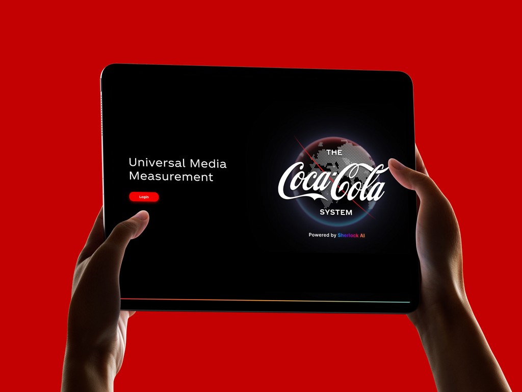
Universal Media Measurement (UMM) is a proprietary analytics platform built by SherlockAI for The Coca-Cola System. It serves as the central hub where marketing teams across global operating units track media investment, measure campaign impacts, evaluate quality scores, and simulate future media-mix scenarios, all in one place. The platform was already functional, but its original interface lacked the visual polish and clarity expected of an enterprise tool used by senior marketing stakeholders. I was brought in as a UI designer within The Coca-Cola Company to elevate the dashboard’s look and feel, making it more intuitive, visually cohesive, and aligned with the premium standards of The Coca-Cola brand THE CHALLENGE: The existing dashboard was data-rich but visually inconsistent. Filter panels, KPI cards, data tables, and chart visualizations each felt like they belonged to different products. Typography was uneven, spacing was tight, and the dark-theme execution had contrast issues that made key metrics hard to scan at a glance. Specifically, the design needed to address several areas: Visual hierarchy: Important KPIs and trend indicators didn’t stand out from surrounding content, forcing users to work harder to find what mattered. Component inconsistency: Buttons, cards, filters, and navigation elements lacked a unified design language, creating cognitive friction across screens. Data visualization clarity: Charts like treemaps and horizontal bar graphs used a limited, mostly red palette that made it difficult to distinguish between touchpoint categories. Brand alignment: While the dashboard carried the Coca-Cola logo, its look and feel didn’t reflect the brand’s premium identity.

About the project
MY APPROACH
1. Audit and Inventory
I began by cataloguing every existing UI component, icons, buttons, brand logos, flag selectors, navigation elements, filter panels, KPI cards, chart types, and table layouts. This gave me a full picture of the surface area that needed attention and helped me identify where inconsistencies were most visible.
2. Establish a Component Library
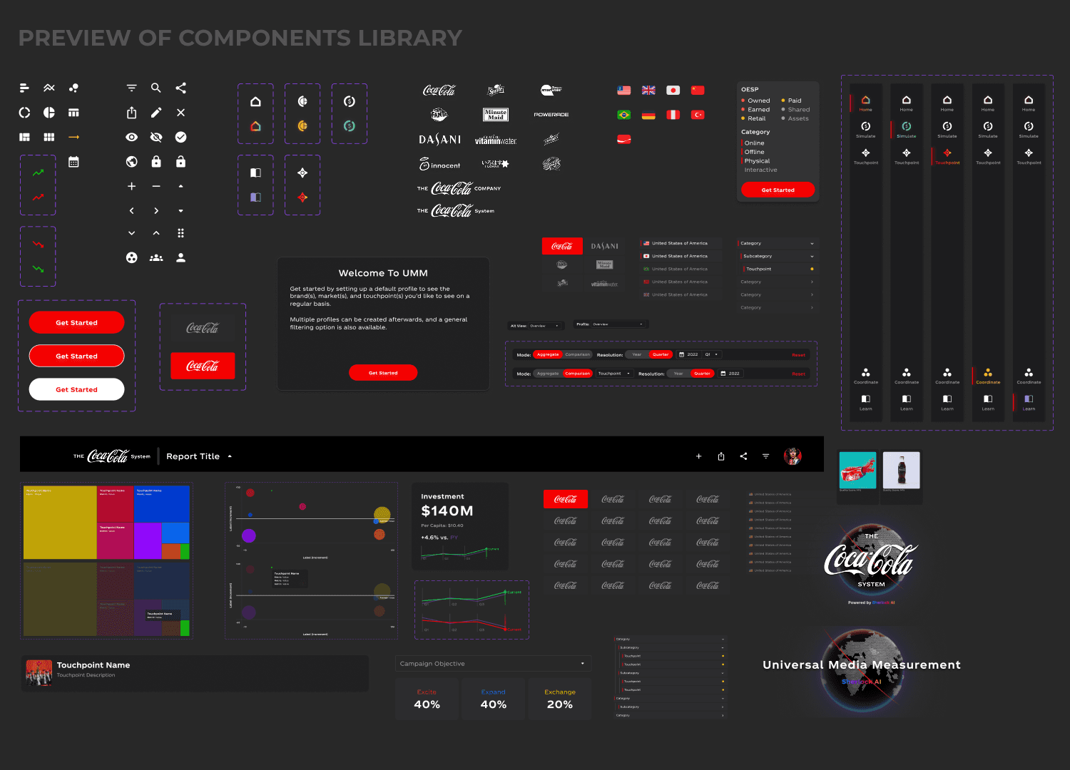
Rather than redesigning screens in isolation, I built a cohesive component library first. This included refined icon sets, standardized button states (default, hover, active), brand logo treatments, country and flag selectors, OESP category tags (Owned, Earned, Shared, Paid), and consistent card and panel styles. Having this foundation ensured every screen would inherit the same visual DNA.
3. Redesign Core Screens
With the component library in place, I redesigned each major view of the platform:
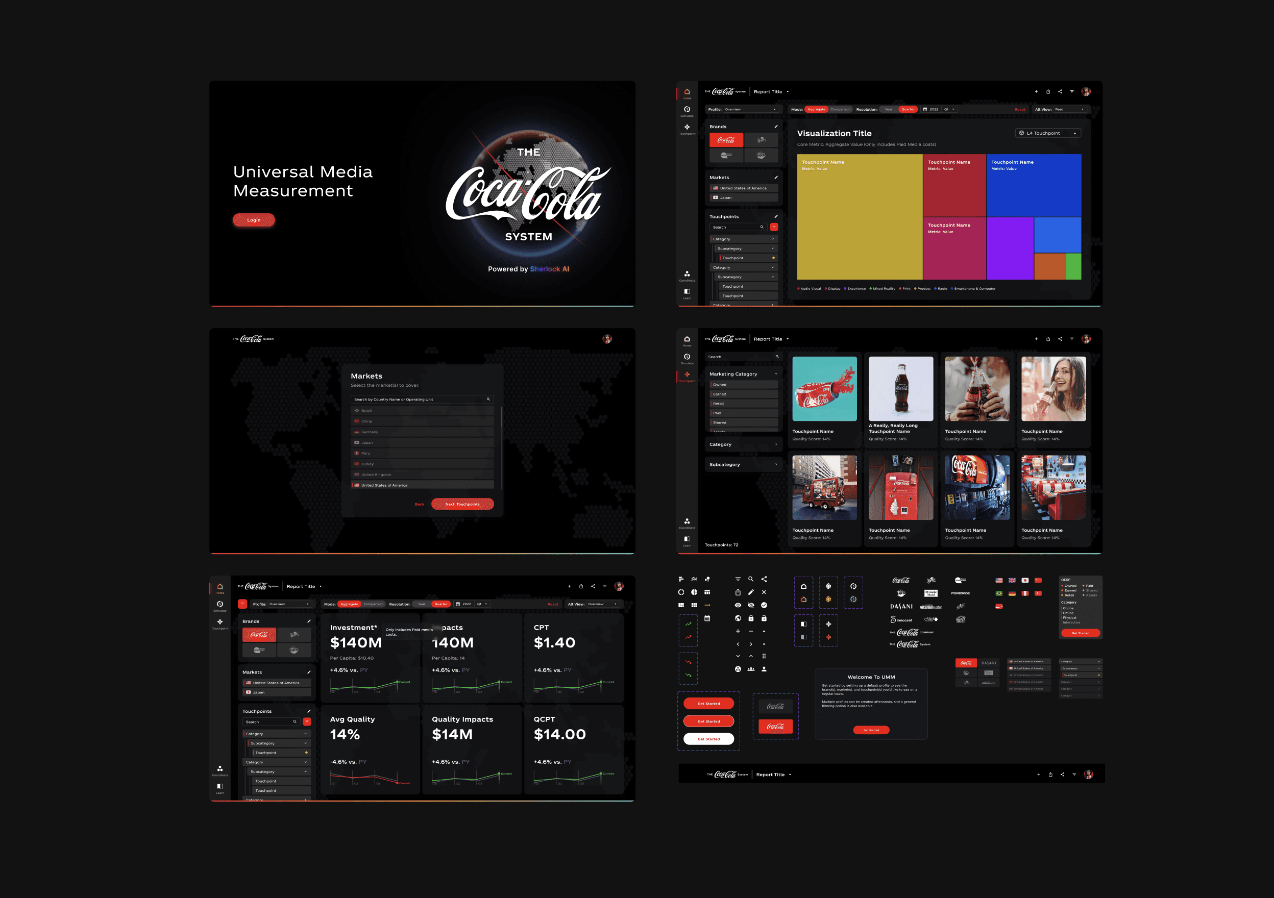
Aggregate Overview: Six KPI cards (Investment, Impacts, CPT, Average Quality, Quality Impacts, QCPT) with clearer typography, per-capita context, and year-over-year trend sparklines in green and red.
Data Tables: Cleaner table layouts with improved column alignment, subtle row dividers, and a color-coded header that distinguishes metric columns at a glance.
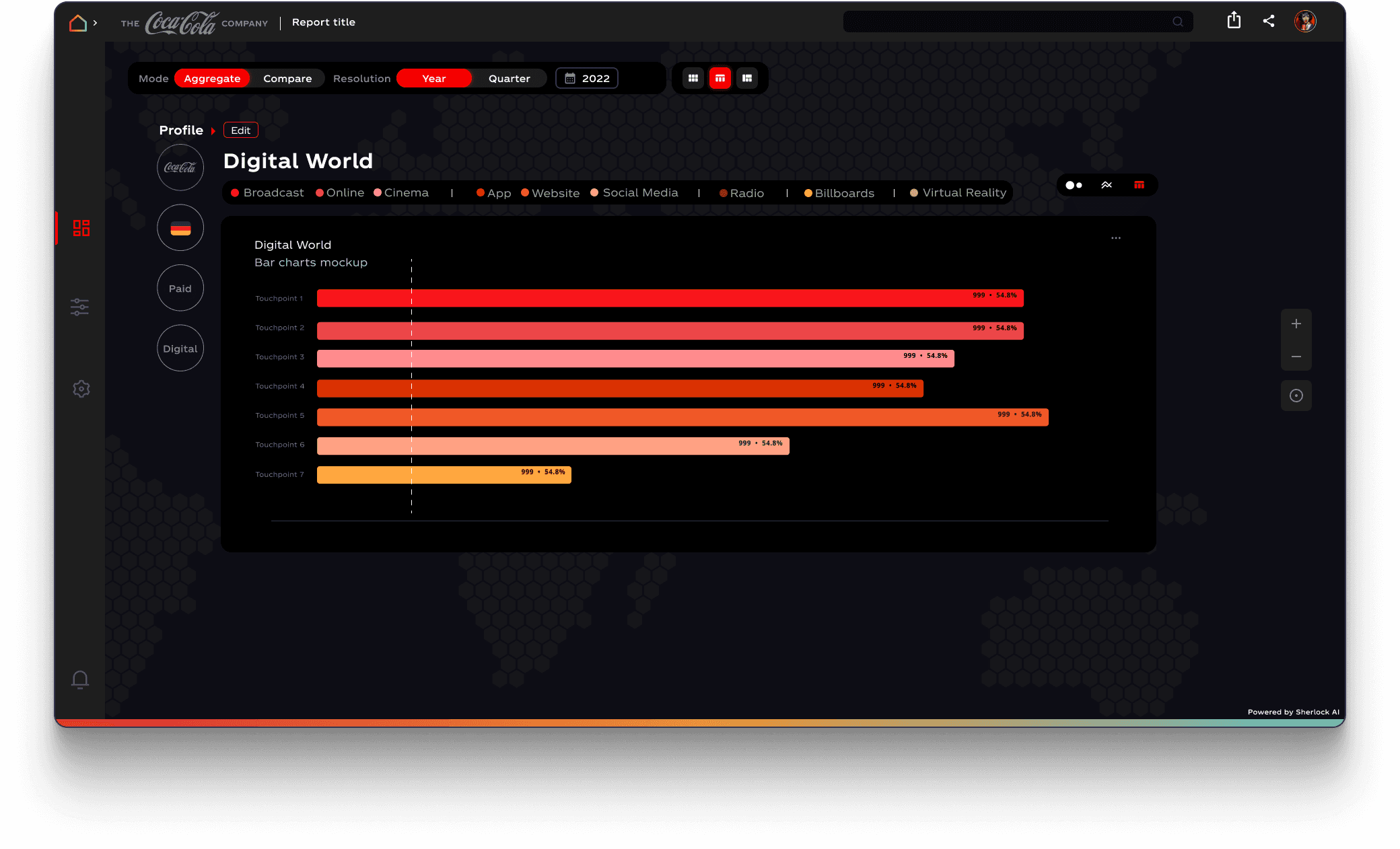
Visualization Views: Treemaps and bar charts now use a diverse, multi-color palette (red, yellow, blue, orange, magenta, teal) instead of a monochrome red scheme, making it far easier to differentiate touchpoints like Cooler, Standard Packaging, Social Feed Ad, and others.
Planning and Simulation Tools: The Auto Simulate and Manual Simulate interfaces received improved layout with a clear left-panel filter system, prominent action buttons, and a streamlined table for adjusting investment and impact targets per touchpoint.
Touchpoint Library: A browsable gallery view with image thumbnails and quality scores, filterable by Marketing Category and Subcategory.
4. Refine the Dark Theme
The platform uses a dark UI to reduce eye strain during long analytical sessions. I refined the dark palette to improve contrast ratios, introduced subtle card elevation through border treatments rather than heavy shadows, and ensured text remained highly legible across all panel backgrounds.
KEY DESIGN DECISIONS
Multi-color data palette: Moving away from a brand-red-only palette for charts was a deliberate trade-off. While red is iconic for Coca-Cola, data visualization demands differentiability. The new palette preserves red as the primary accent while introducing complementary colors for clarity.
Left sidebar navigation: Relocating filters and profile controls into a persistent left sidebar freed up vertical space for data and provided a consistent anchor point across all views.
Sparkline integration in KPI cards: Adding inline trend charts directly within each KPI card reduced the need to switch views to understand directional performance, supporting faster decision-making.
Component-first approach: Building the component library before touching any screens ensured consistency from the start and dramatically reduced iteration cycles during the redesign phase.


This will hide itself!
Universal Media Measurement (UMM) is a proprietary analytics platform built by SherlockAI for The Coca-Cola System. It serves as the central hub where marketing teams across global operating units track media investment, measure campaign impacts, evaluate quality scores, and simulate future media-mix scenarios, all in one place. The platform was already functional, but its original interface lacked the visual polish and clarity expected of an enterprise tool used by senior marketing stakeholders. I was brought in as a UI designer within The Coca-Cola Company to elevate the dashboard’s look and feel, making it more intuitive, visually cohesive, and aligned with the premium standards of The Coca-Cola brand THE CHALLENGE: The existing dashboard was data-rich but visually inconsistent. Filter panels, KPI cards, data tables, and chart visualizations each felt like they belonged to different products. Typography was uneven, spacing was tight, and the dark-theme execution had contrast issues that made key metrics hard to scan at a glance. Specifically, the design needed to address several areas: Visual hierarchy: Important KPIs and trend indicators didn’t stand out from surrounding content, forcing users to work harder to find what mattered. Component inconsistency: Buttons, cards, filters, and navigation elements lacked a unified design language, creating cognitive friction across screens. Data visualization clarity: Charts like treemaps and horizontal bar graphs used a limited, mostly red palette that made it difficult to distinguish between touchpoint categories. Brand alignment: While the dashboard carried the Coca-Cola logo, its look and feel didn’t reflect the brand’s premium identity.
About the project
MY APPROACH
1. Audit and Inventory
I began by cataloguing every existing UI component, icons, buttons, brand logos, flag selectors, navigation elements, filter panels, KPI cards, chart types, and table layouts. This gave me a full picture of the surface area that needed attention and helped me identify where inconsistencies were most visible.
2. Establish a Component Library
Rather than redesigning screens in isolation, I built a cohesive component library first. This included refined icon sets, standardized button states (default, hover, active), brand logo treatments, country and flag selectors, OESP category tags (Owned, Earned, Shared, Paid), and consistent card and panel styles. Having this foundation ensured every screen would inherit the same visual DNA.
3. Redesign Core Screens
With the component library in place, I redesigned each major view of the platform:
Aggregate Overview: Six KPI cards (Investment, Impacts, CPT, Average Quality, Quality Impacts, QCPT) with clearer typography, per-capita context, and year-over-year trend sparklines in green and red.
Data Tables: Cleaner table layouts with improved column alignment, subtle row dividers, and a color-coded header that distinguishes metric columns at a glance.
Visualization Views: Treemaps and bar charts now use a diverse, multi-color palette (red, yellow, blue, orange, magenta, teal) instead of a monochrome red scheme, making it far easier to differentiate touchpoints like Cooler, Standard Packaging, Social Feed Ad, and others.
Planning and Simulation Tools: The Auto Simulate and Manual Simulate interfaces received improved layout with a clear left-panel filter system, prominent action buttons, and a streamlined table for adjusting investment and impact targets per touchpoint.
Touchpoint Library: A browsable gallery view with image thumbnails and quality scores, filterable by Marketing Category and Subcategory.
4. Refine the Dark Theme
The platform uses a dark UI to reduce eye strain during long analytical sessions. I refined the dark palette to improve contrast ratios, introduced subtle card elevation through border treatments rather than heavy shadows, and ensured text remained highly legible across all panel backgrounds.
KEY DESIGN DECISIONS
Multi-color data palette: Moving away from a brand-red-only palette for charts was a deliberate trade-off. While red is iconic for Coca-Cola, data visualization demands differentiability. The new palette preserves red as the primary accent while introducing complementary colors for clarity.
Left sidebar navigation: Relocating filters and profile controls into a persistent left sidebar freed up vertical space for data and provided a consistent anchor point across all views.
Sparkline integration in KPI cards: Adding inline trend charts directly within each KPI card reduced the need to switch views to understand directional performance, supporting faster decision-making.
Component-first approach: Building the component library before touching any screens ensured consistency from the start and dramatically reduced iteration cycles during the redesign phase.
This will hide itself!