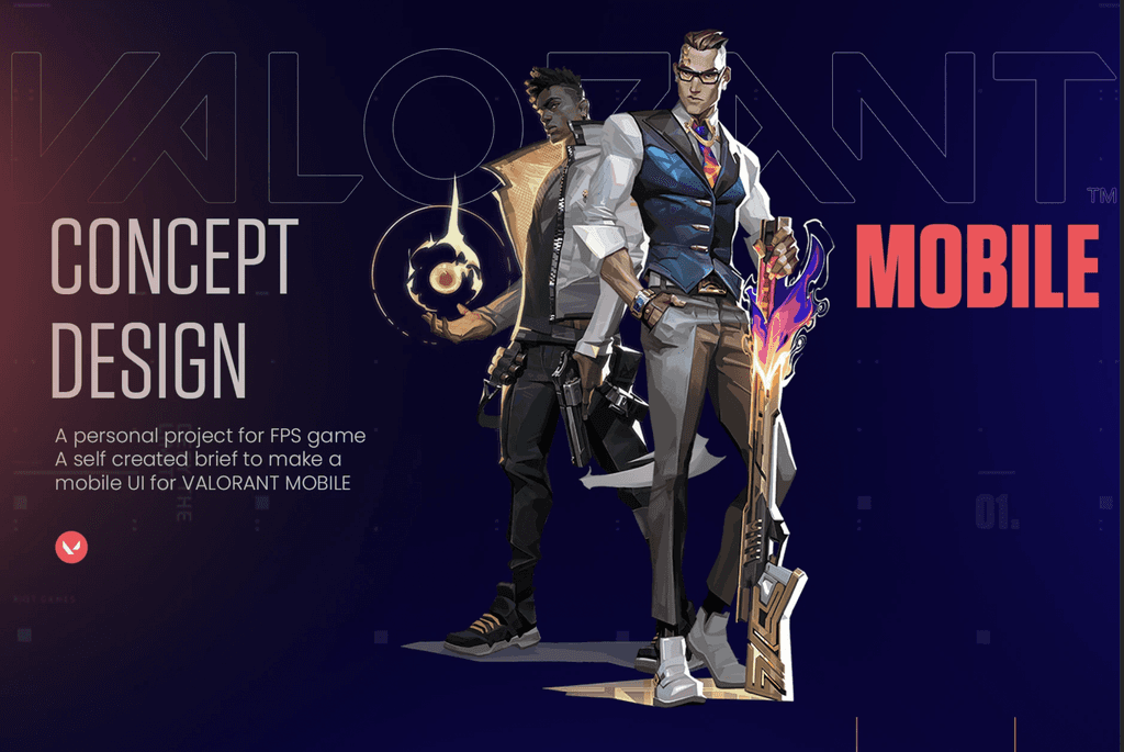
This project is an independent exploration of how Valorant’s desktop experience could translate into a mobile environment. The goal was to understand the core interaction patterns, visual language, and gameplay requirements of the original game, then redesign key UI components so they function intuitively on a smaller, touch‑based interface.
About the project
About the Project
Objective
Valorant’s desktop UI is built for precision, large screens, and keyboard–mouse input. This case study focuses on rethinking essential UI elements for mobile while maintaining:
Visual consistency with the Valorant brand
Competitive clarity
Fast decision‑making during gameplay
Accessibility for touch‑based controls
Approach
The redesign followed a structured workflow:
1. Visual System Adaptation
Recreated core UI components (HUD, menus, ability icons) using mobile‑friendly proportions.
Simplified dense desktop layouts into modular, readable blocks.
Adjusted typography, spacing, and contrast for small‑screen legibility.
2. Interaction Model Redesign
Converted complex keyboard‑mouse actions into intuitive touch gestures.
Prioritized thumb‑reach zones to reduce input friction.
Reorganized ability triggers, weapon switching, and map access for quick, error‑free use.
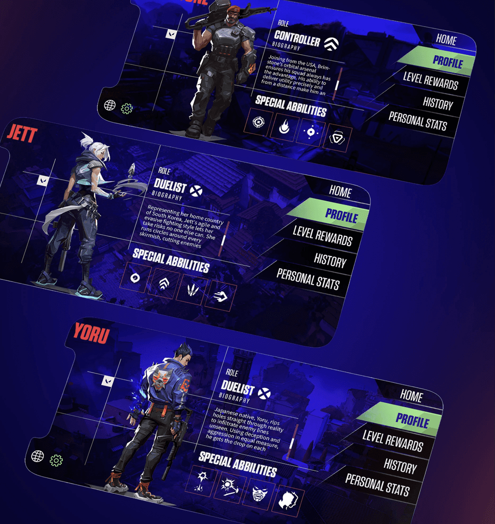
3. Key Screens Designed
Home screen
Agent selection
Loadout
HUD (in‑game)
Ability and weapon interactions
Settings and onboarding flows
Each screen was designed to preserve the competitive feel of Valorant while ensuring usability on mobile.
4. Motion & Micro‑Interactions
Designed animations to support clarity and responsiveness.
Added transitions for menus, ability charging states, and feedback cues.
Ensured motion timing aligned with gameplay urgency (fast, snappy, minimal delay).
Outcome
The final concept demonstrates how Valorant’s desktop experience can be reinterpreted for mobile without losing its identity. The redesigned UI:
Maintains the game’s visual DNA
Improves clarity and usability for touch input
Introduces motion that enhances feedback and immersion
Provides a scalable foundation for future mobile‑first features
This project served as a practical exercise in adapting a complex AAA game interface into a compact, intuitive mobile format.


Smooth Scroll
This will hide itself!
This will hide itself!
Valorant Mobile (UI Design)
OVERVIEW
This project is an independent exploration of how Valorant’s desktop experience could translate into a mobile environment. The goal was to understand the core interaction patterns, visual language, and gameplay requirements of the original game, then redesign key UI components so they function intuitively on a smaller, touch‑based interface.
About the project
About the Project
Objective
Valorant’s desktop UI is built for precision, large screens, and keyboard–mouse input. This case study focuses on rethinking essential UI elements for mobile while maintaining:
Visual consistency with the Valorant brand
Competitive clarity
Fast decision‑making during gameplay
Accessibility for touch‑based controls
Approach
The redesign followed a structured workflow:
1. Visual System Adaptation
Recreated core UI components (HUD, menus, ability icons) using mobile‑friendly proportions.
Simplified dense desktop layouts into modular, readable blocks.
Adjusted typography, spacing, and contrast for small‑screen legibility.
2. Interaction Model Redesign
Converted complex keyboard‑mouse actions into intuitive touch gestures.
Prioritized thumb‑reach zones to reduce input friction.
Reorganized ability triggers, weapon switching, and map access for quick, error‑free use.
3. Key Screens Designed
Home screen
Agent selection
Loadout
HUD (in‑game)
Ability and weapon interactions
Settings and onboarding flows
Each screen was designed to preserve the competitive feel of Valorant while ensuring usability on mobile.
4. Motion & Micro‑Interactions
Designed animations to support clarity and responsiveness.
Added transitions for menus, ability charging states, and feedback cues.
Ensured motion timing aligned with gameplay urgency (fast, snappy, minimal delay).
Outcome
The final concept demonstrates how Valorant’s desktop experience can be reinterpreted for mobile without losing its identity. The redesigned UI:
Maintains the game’s visual DNA
Improves clarity and usability for touch input
Introduces motion that enhances feedback and immersion
Provides a scalable foundation for future mobile‑first features
This project served as a practical exercise in adapting a complex AAA game interface into a compact, intuitive mobile format.
Smooth Scroll
This will hide itself!
This will hide itself!